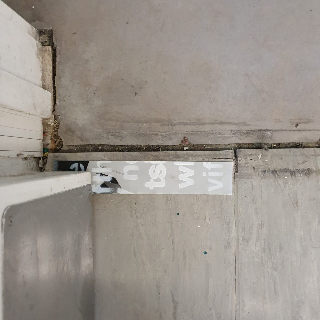
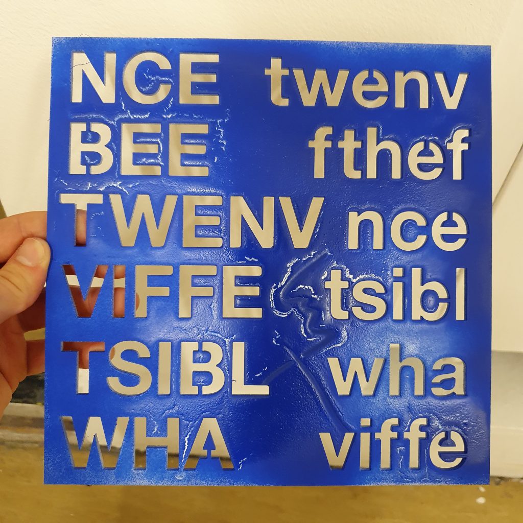
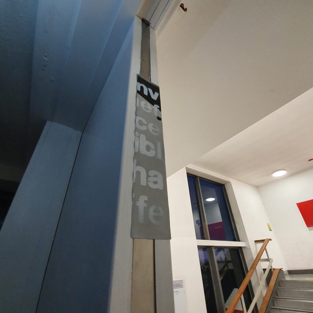
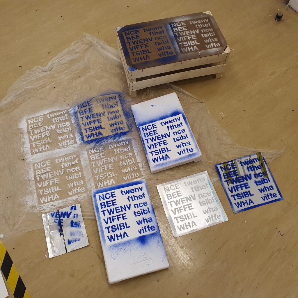
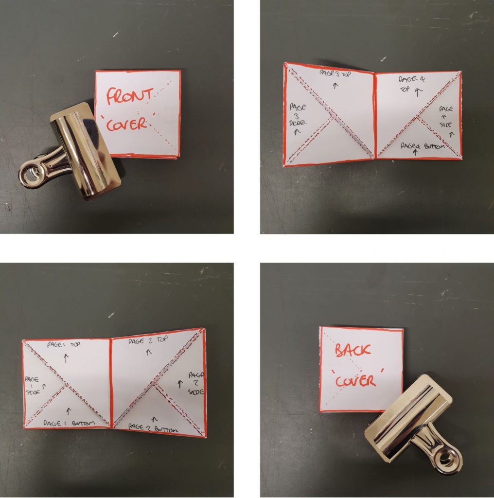
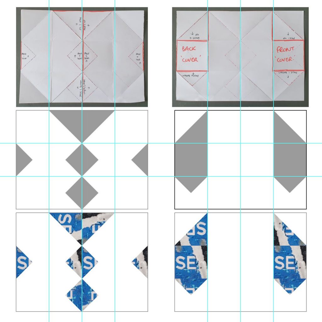
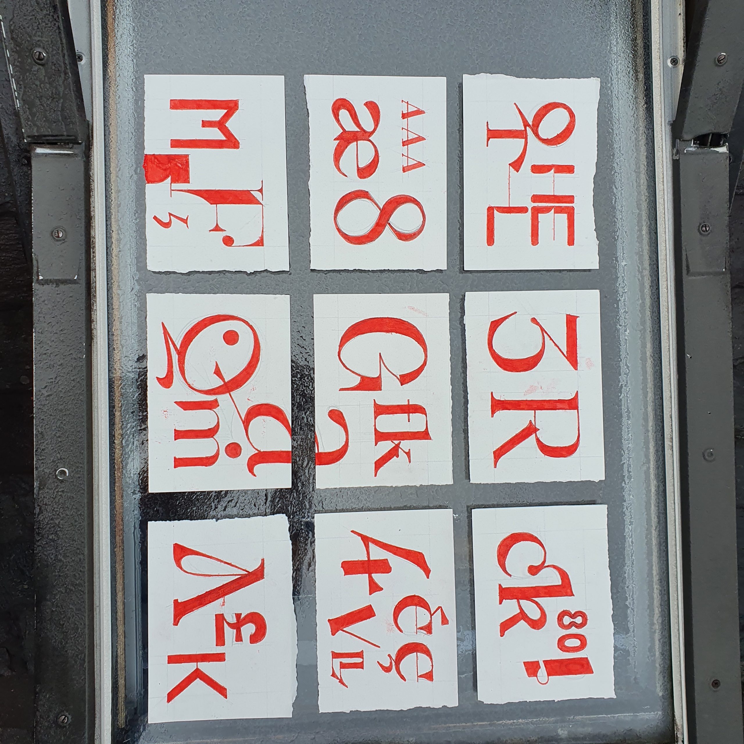
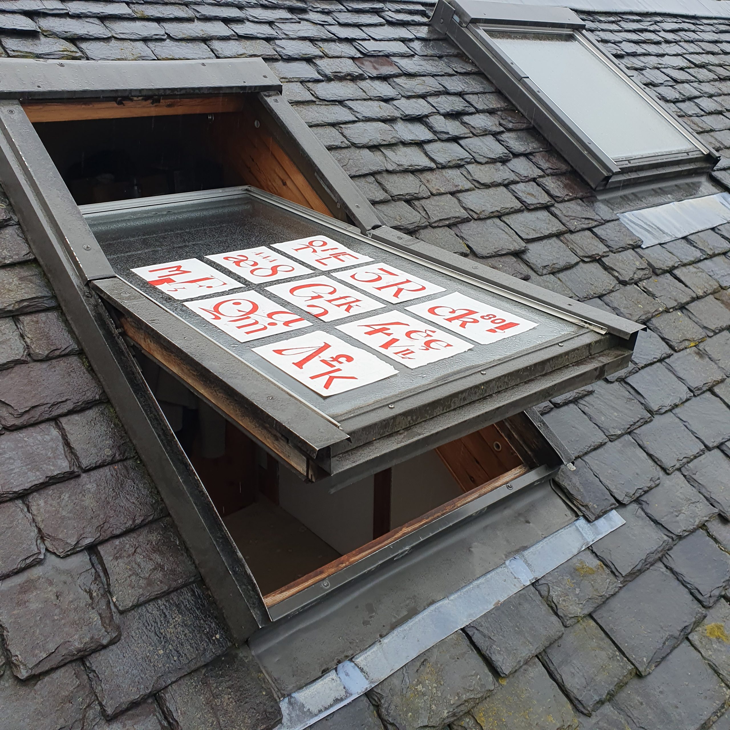
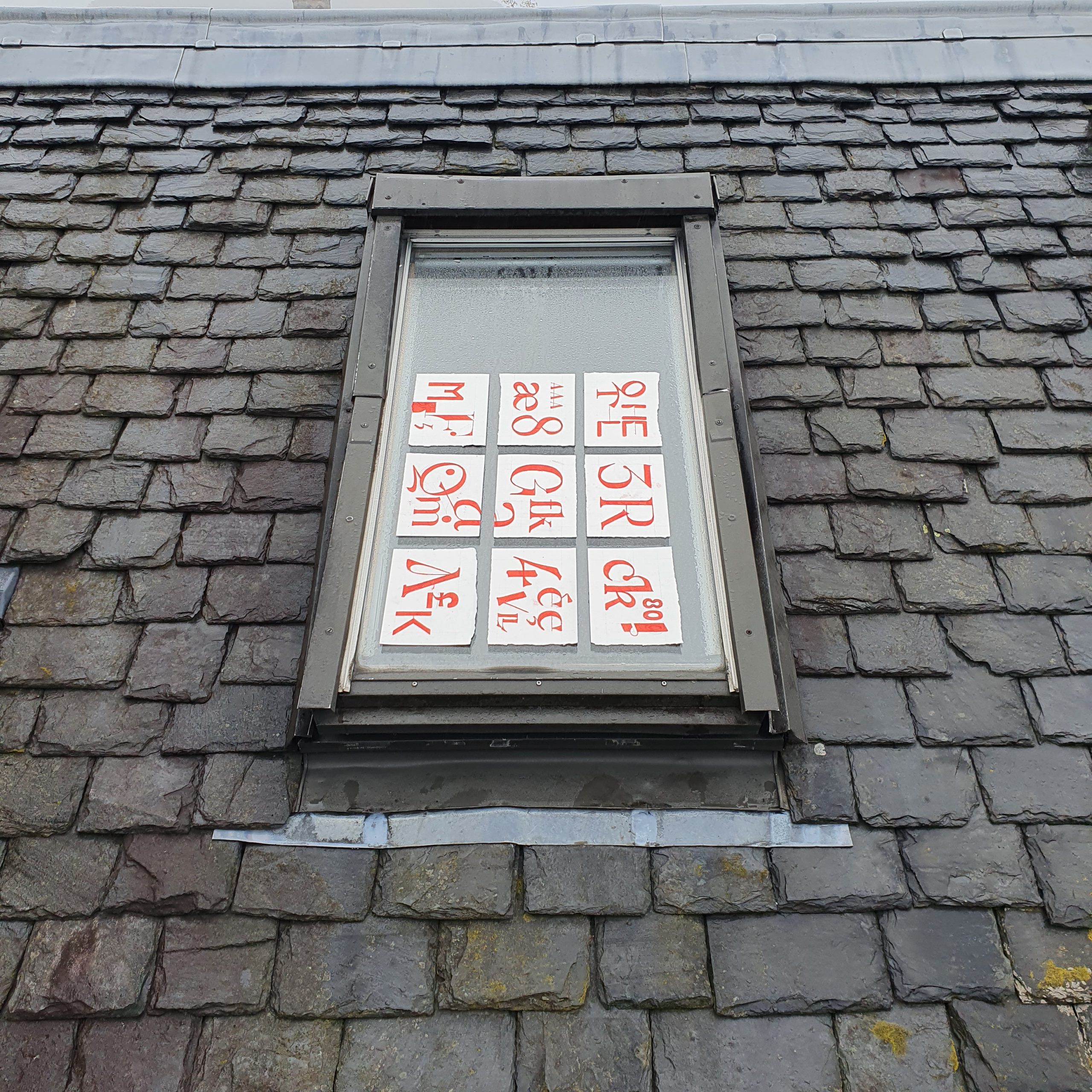
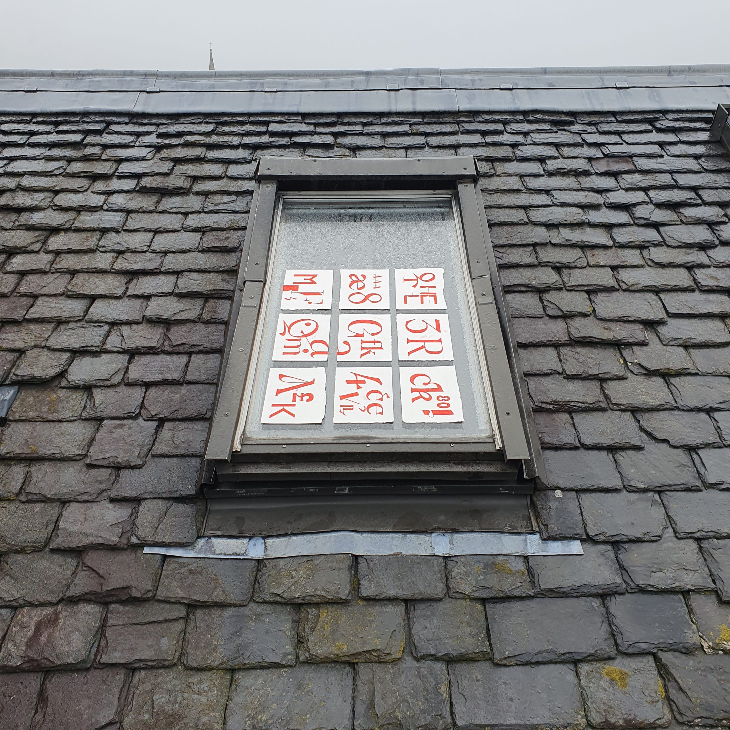
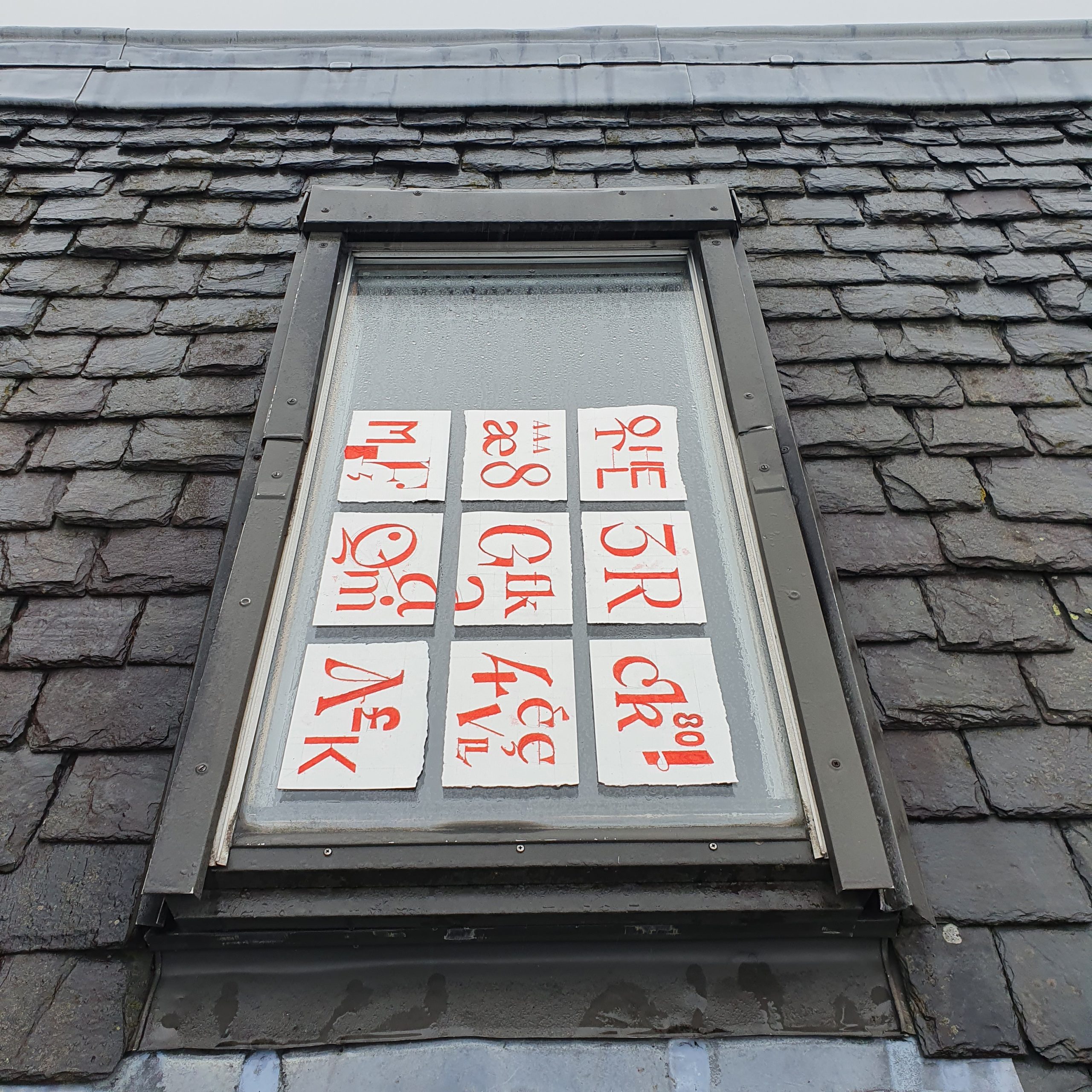
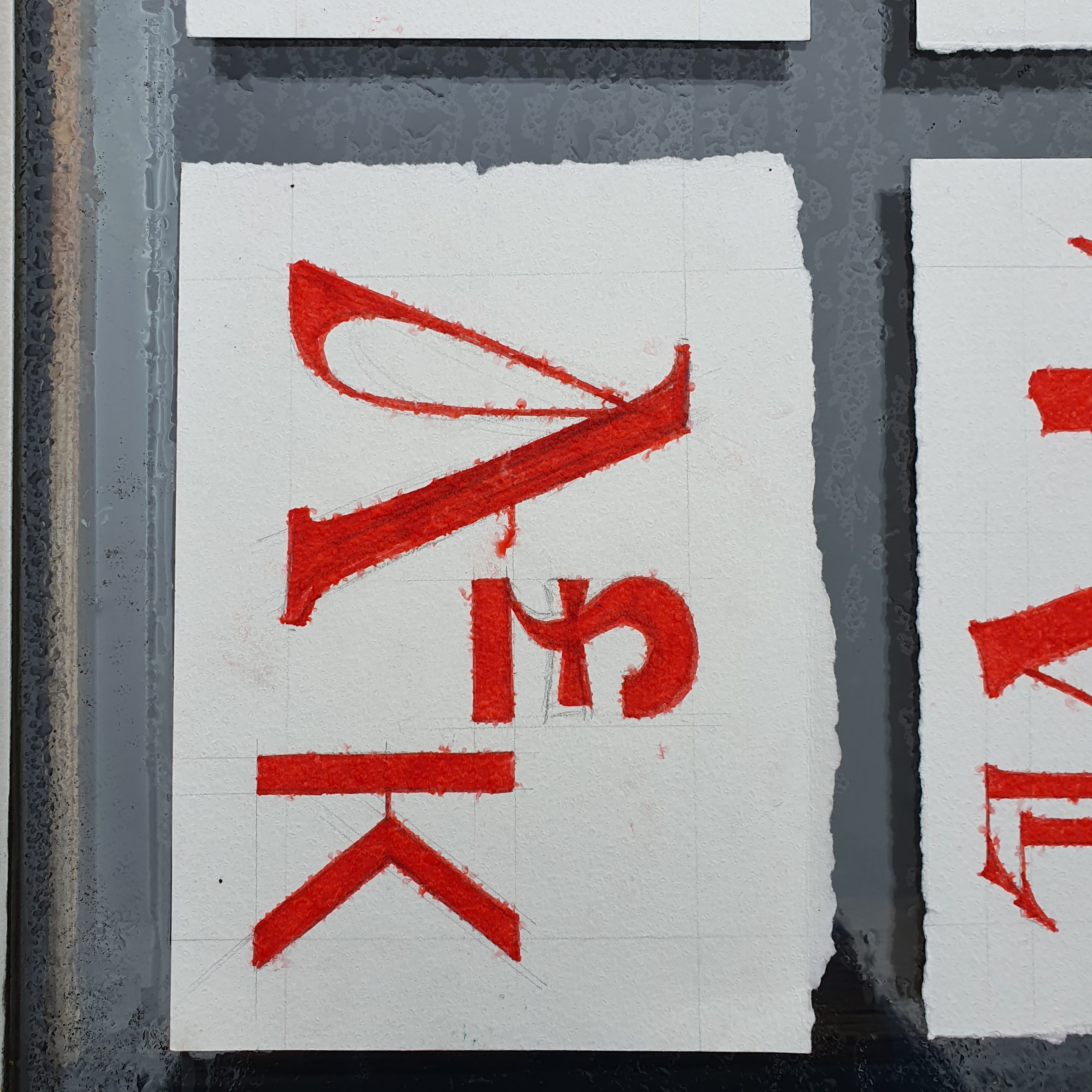
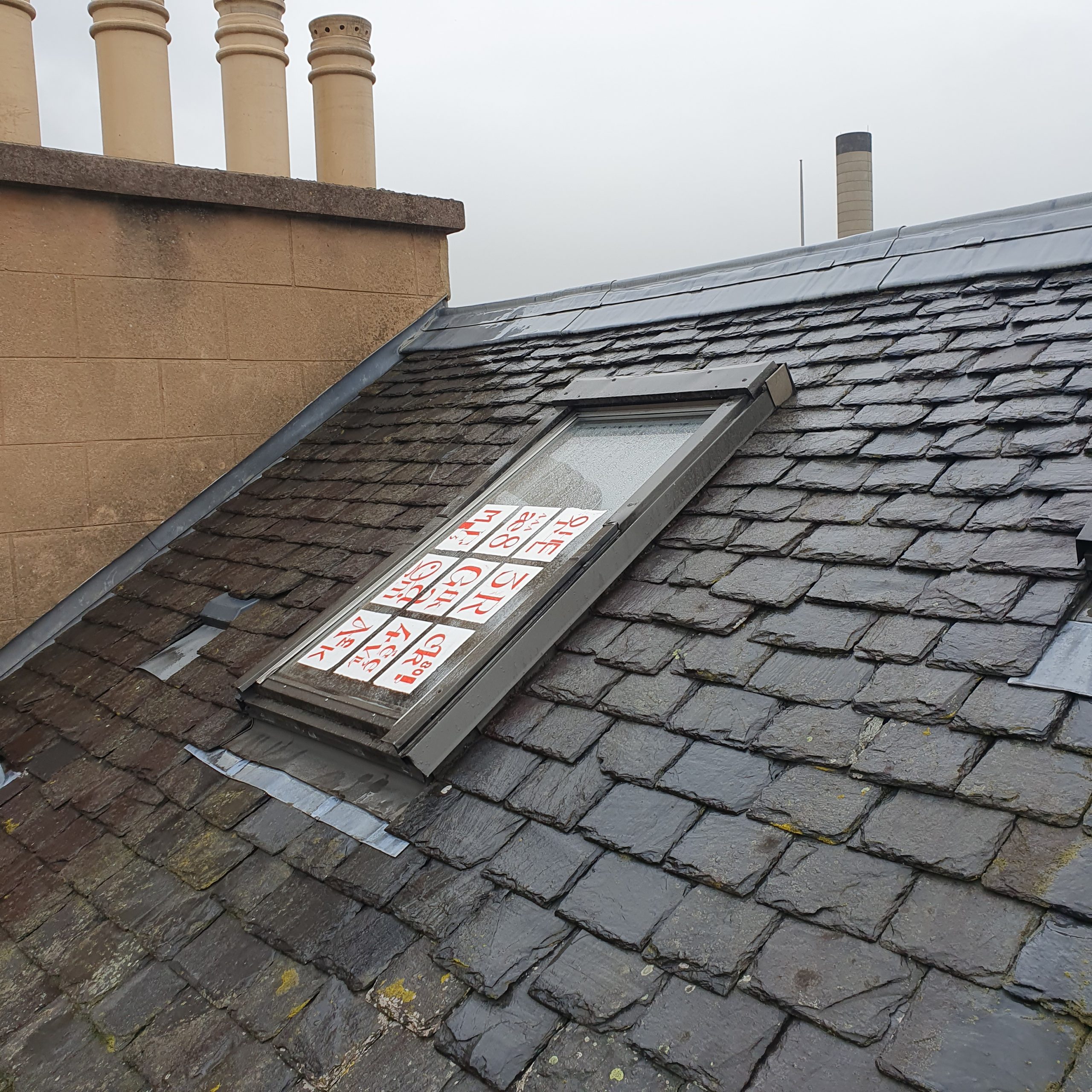
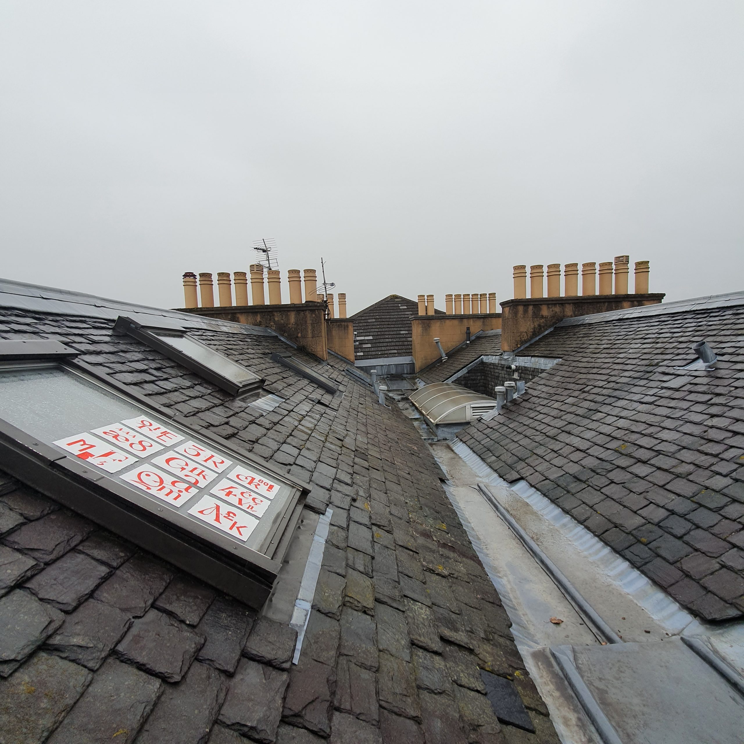
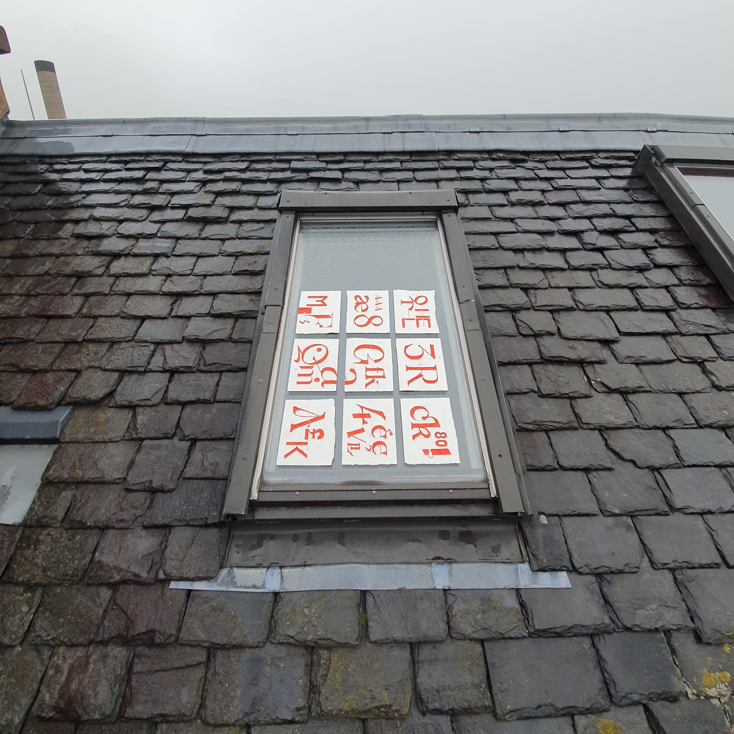
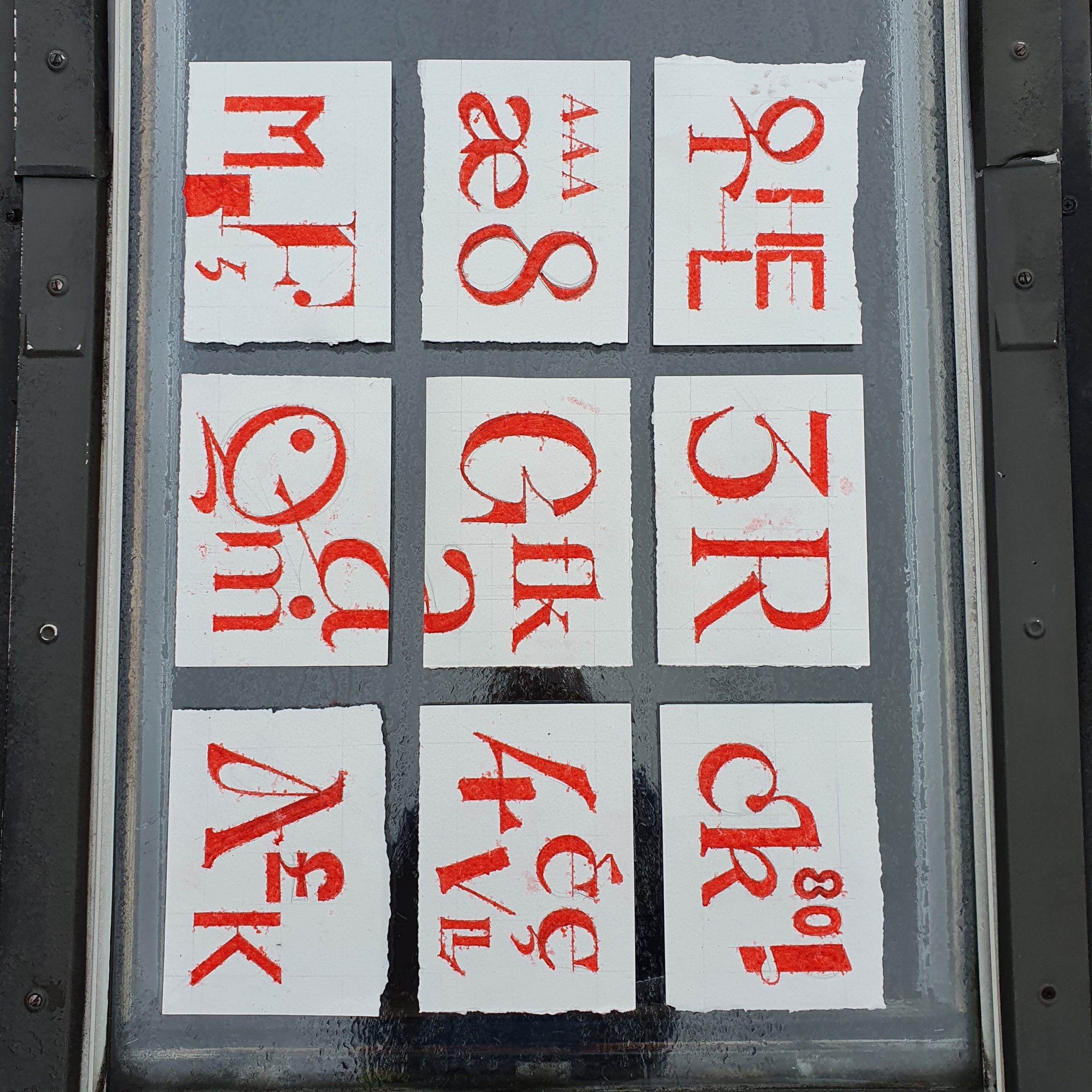
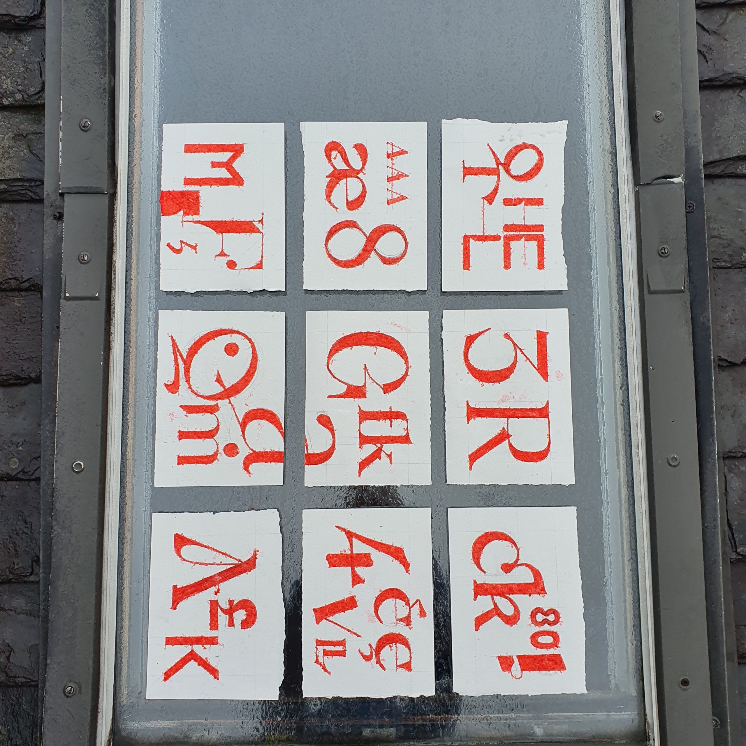
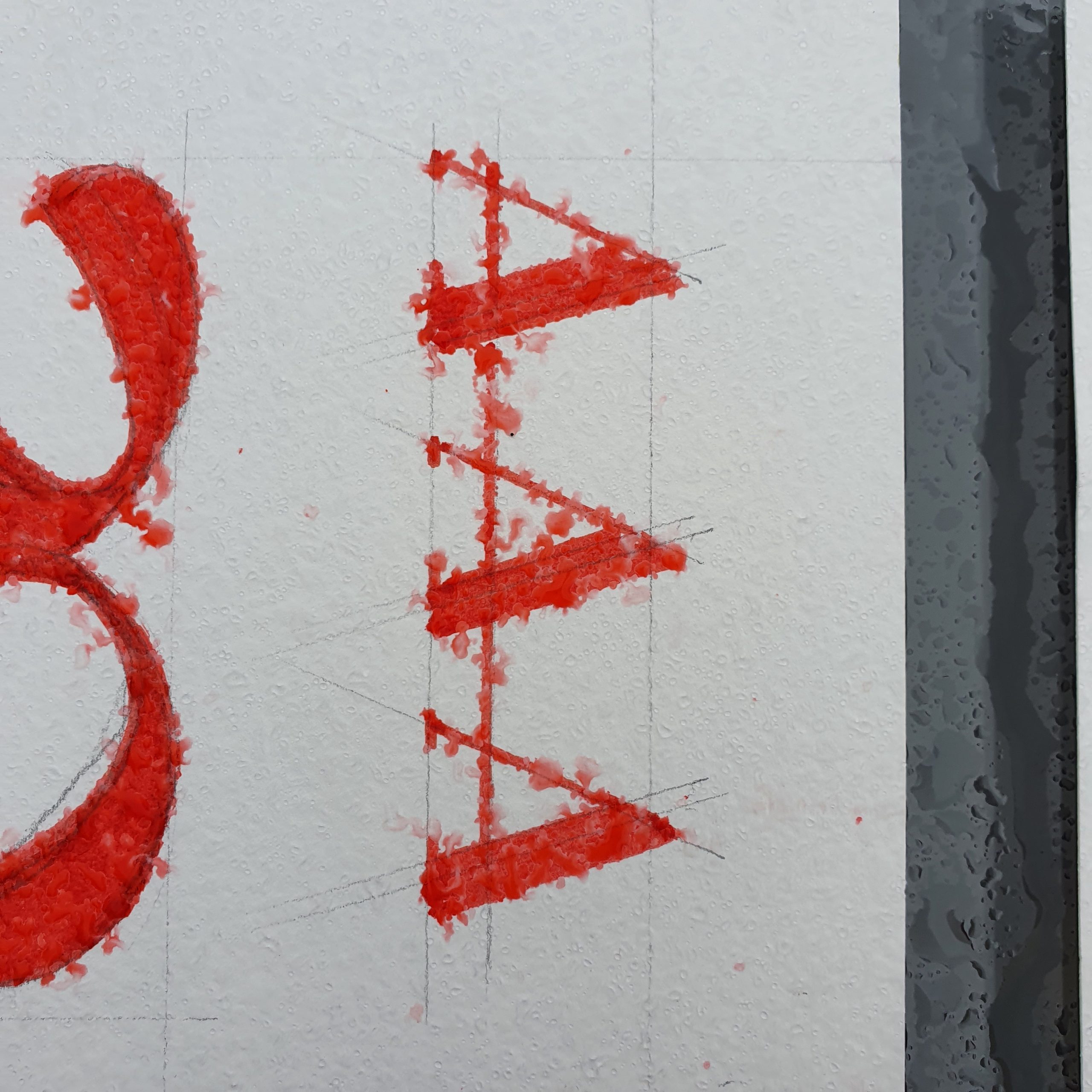
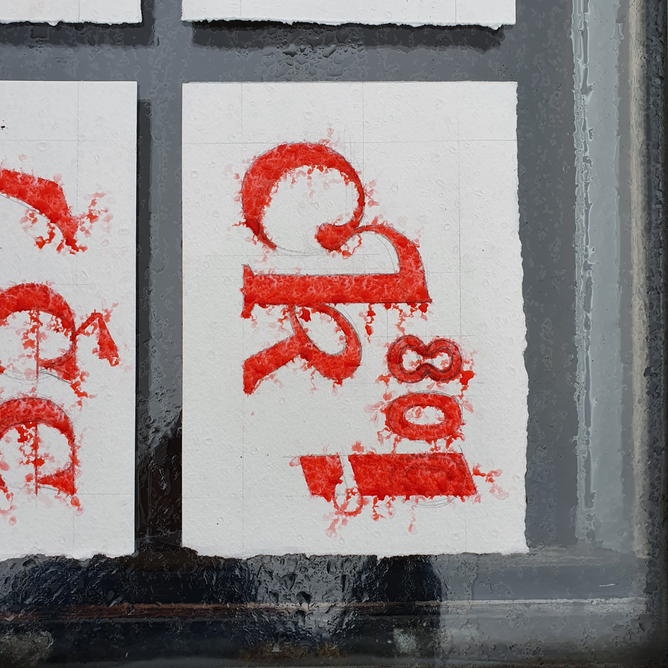
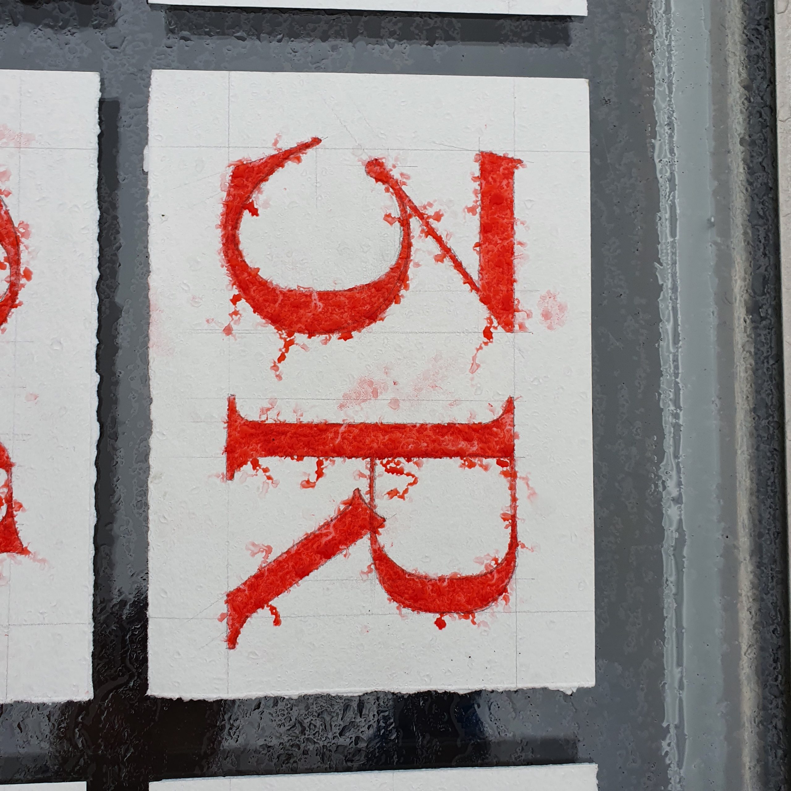
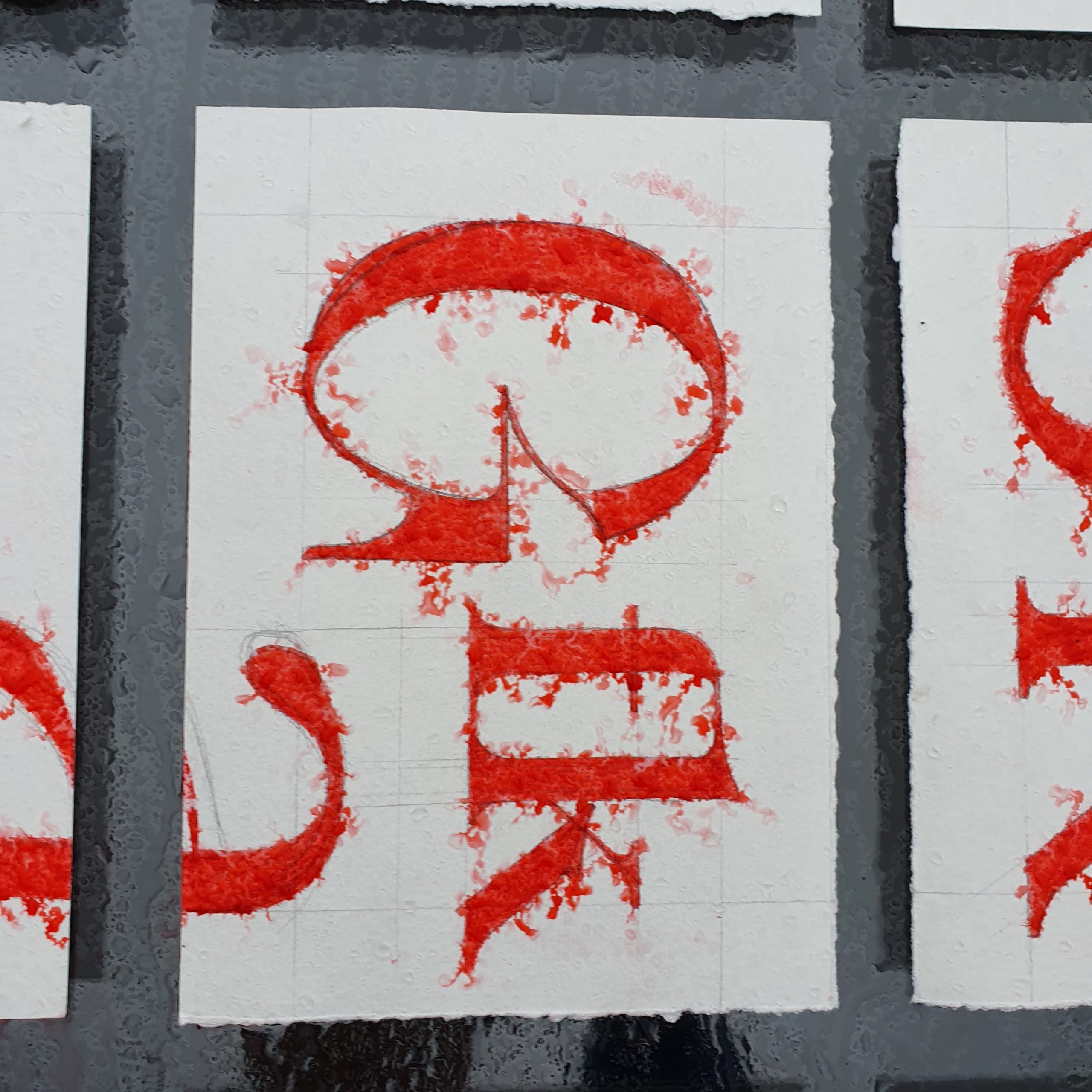
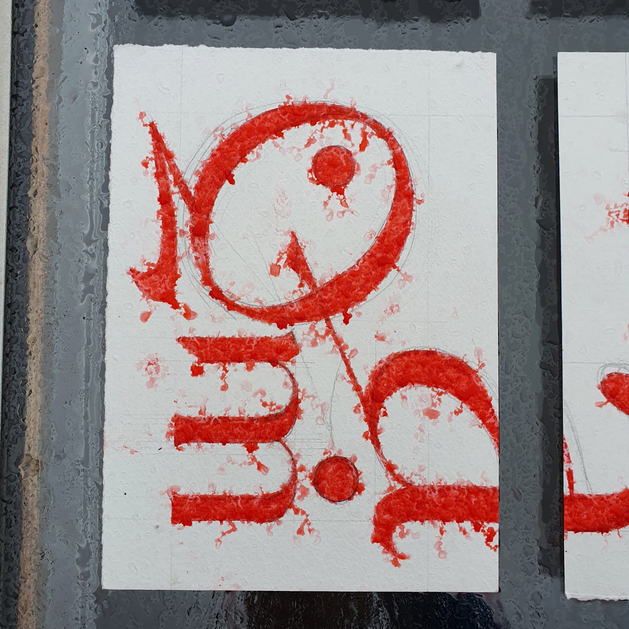
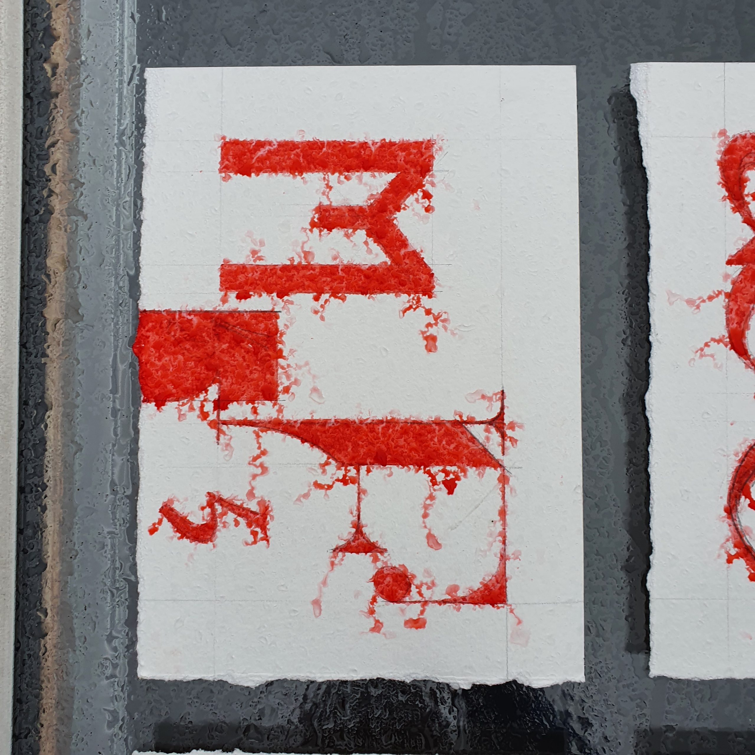
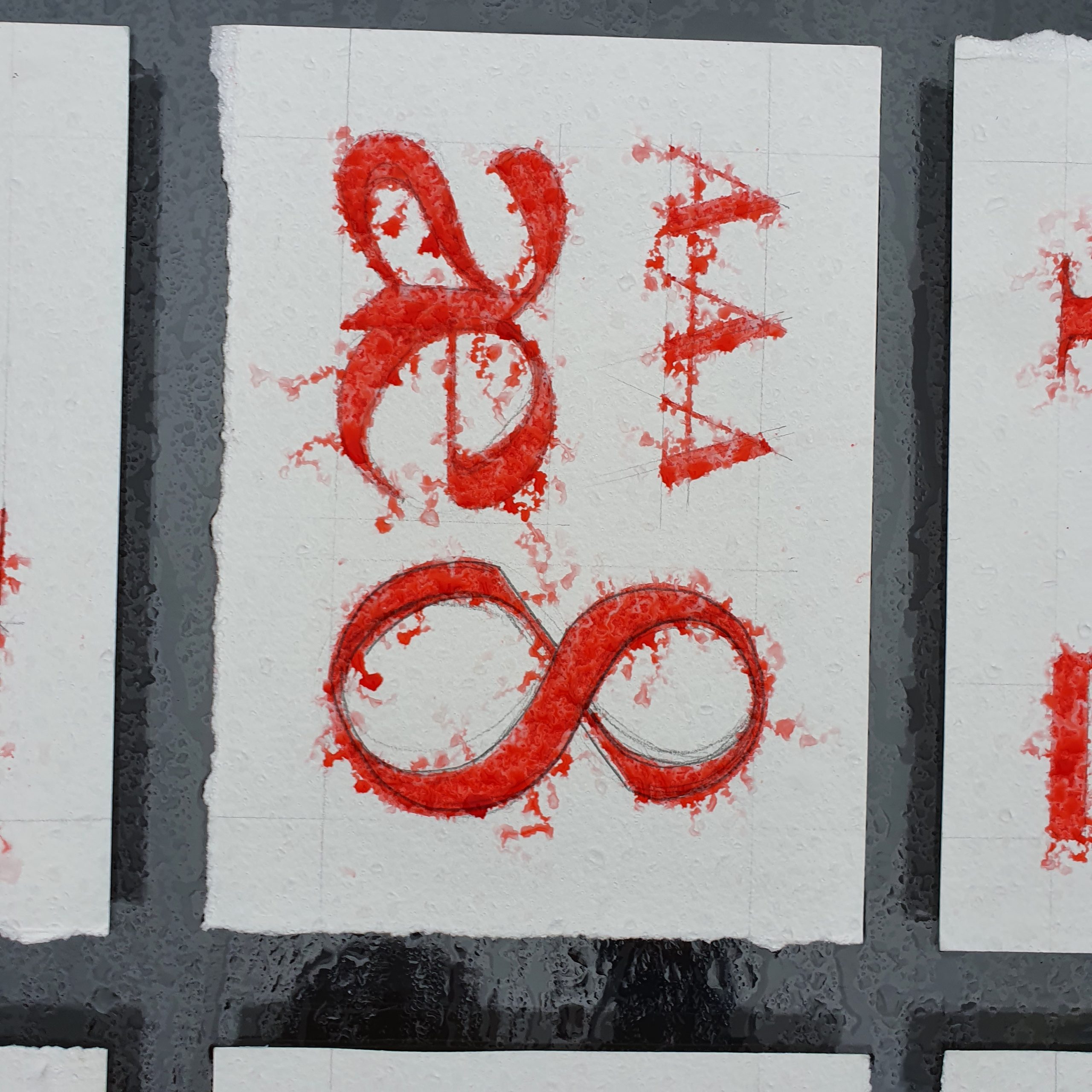
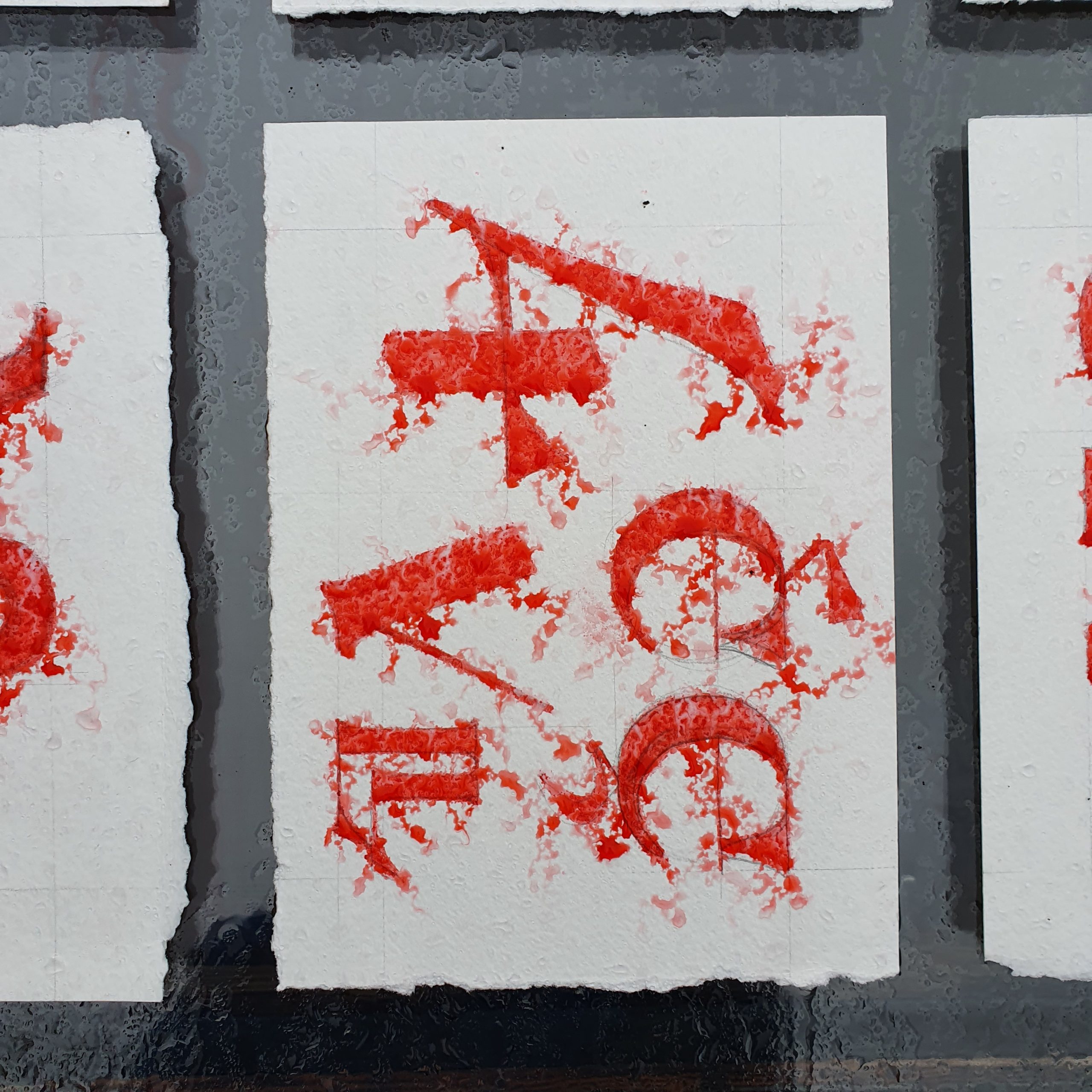
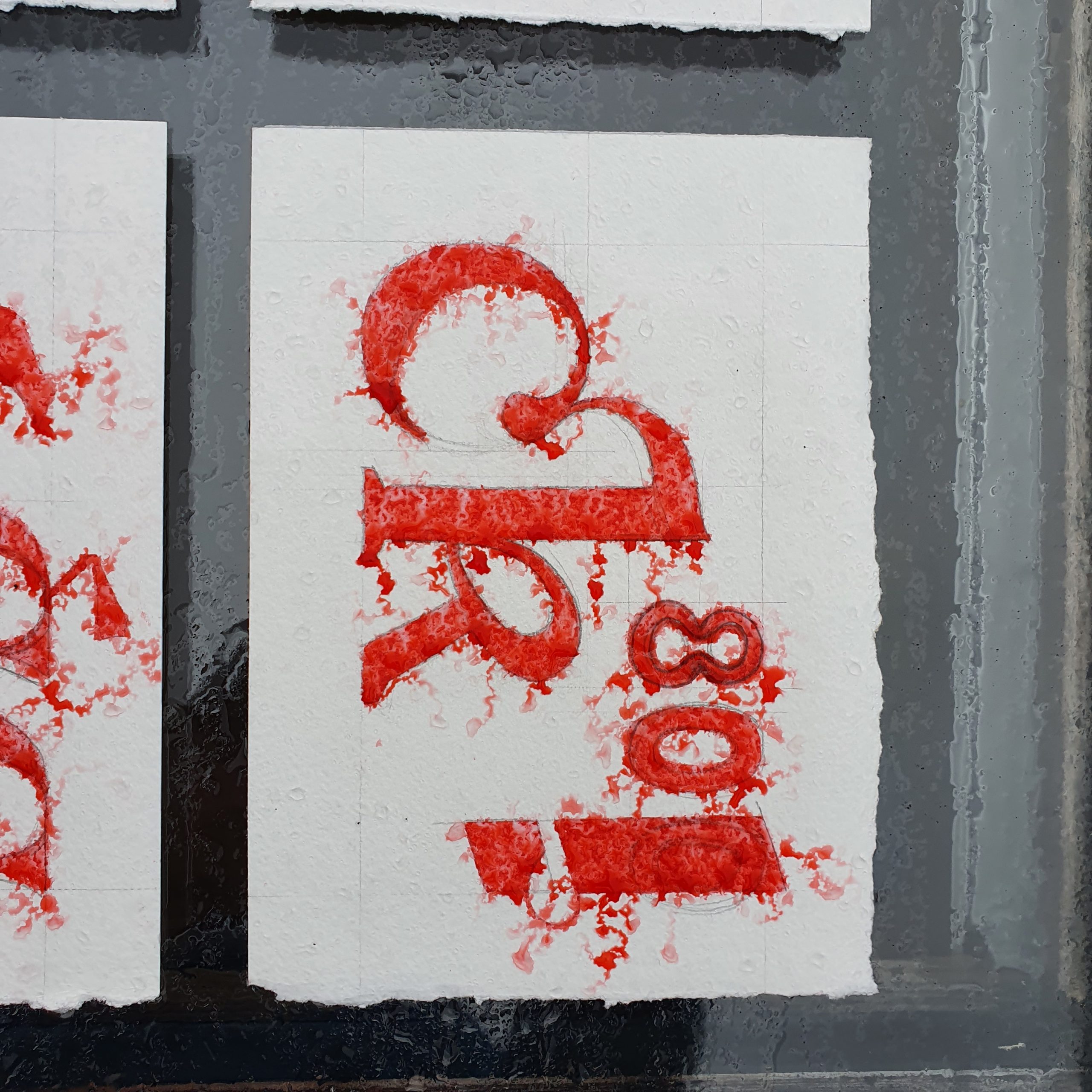
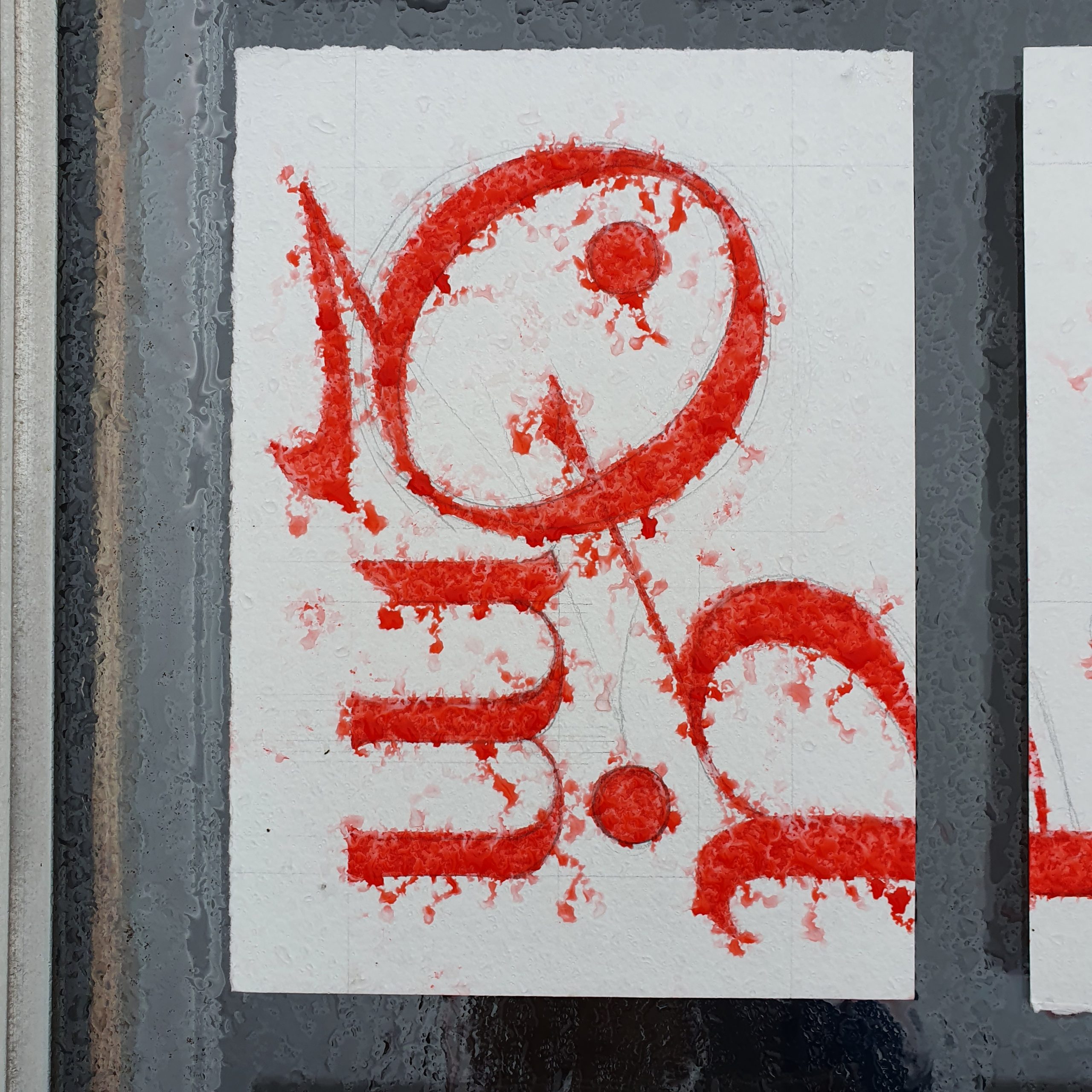
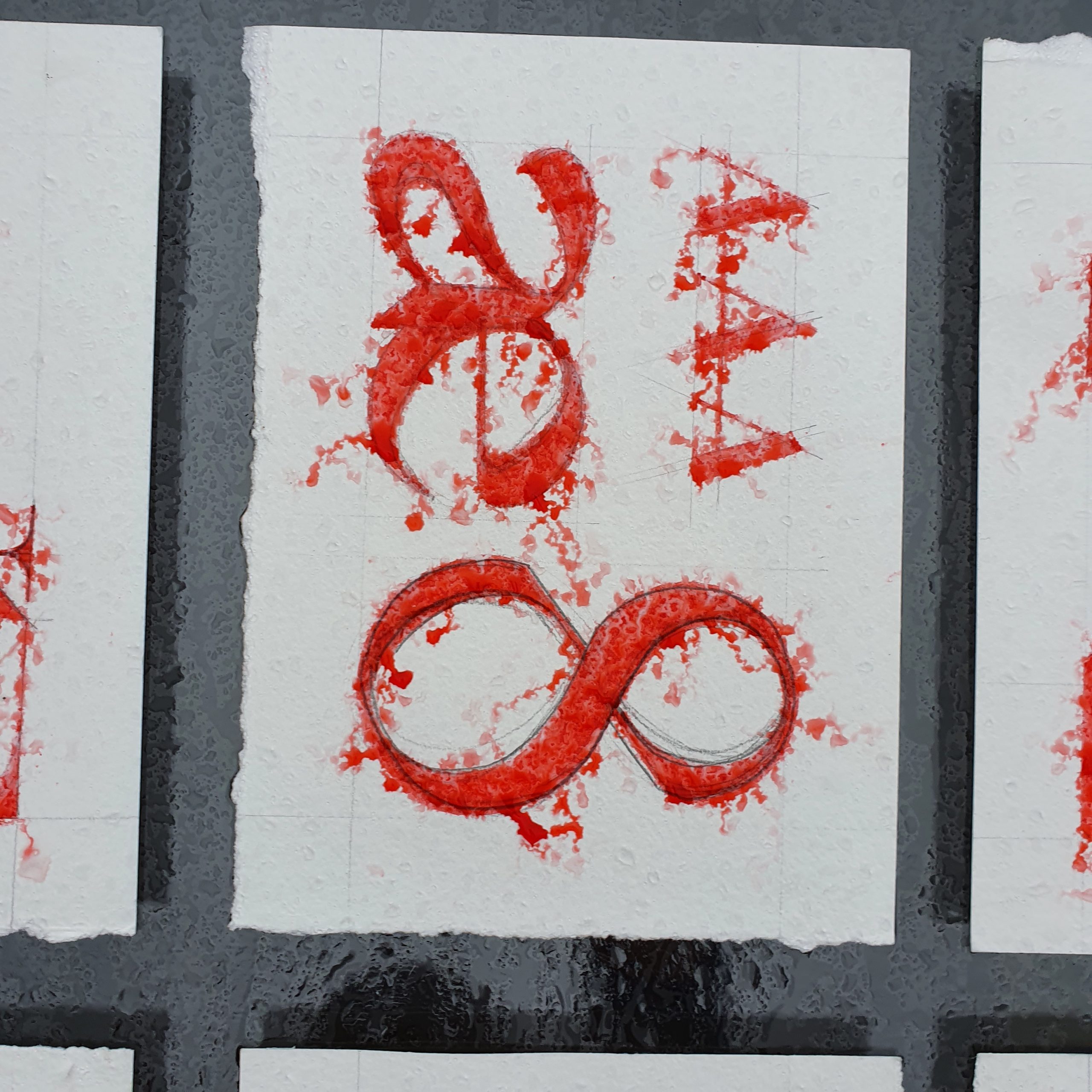
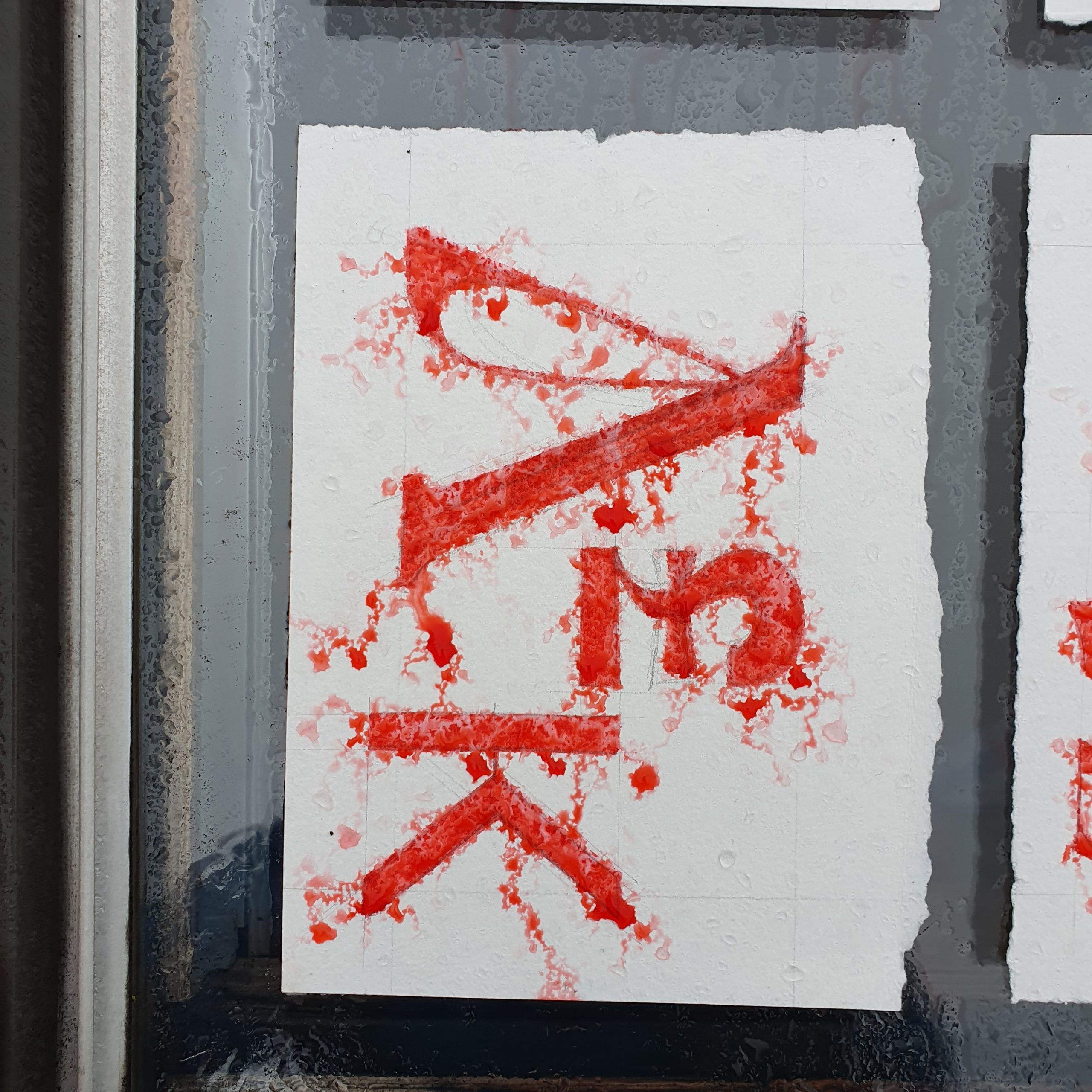
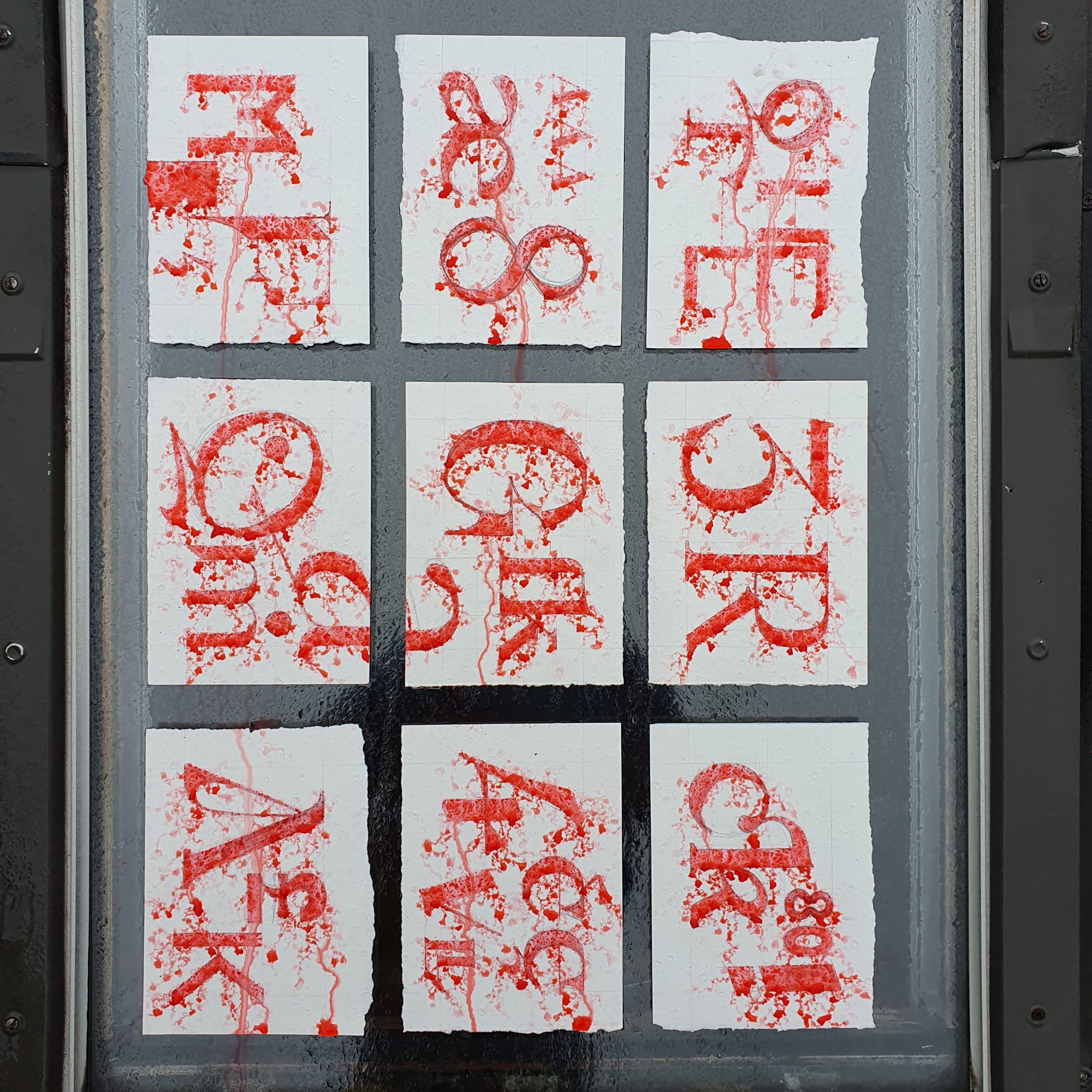
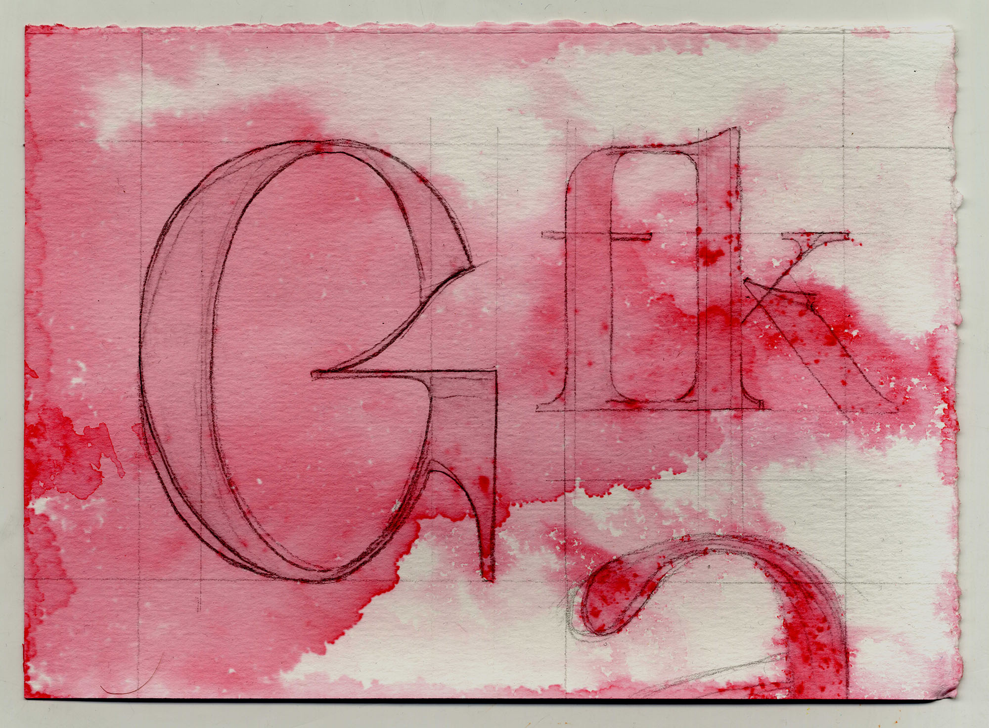
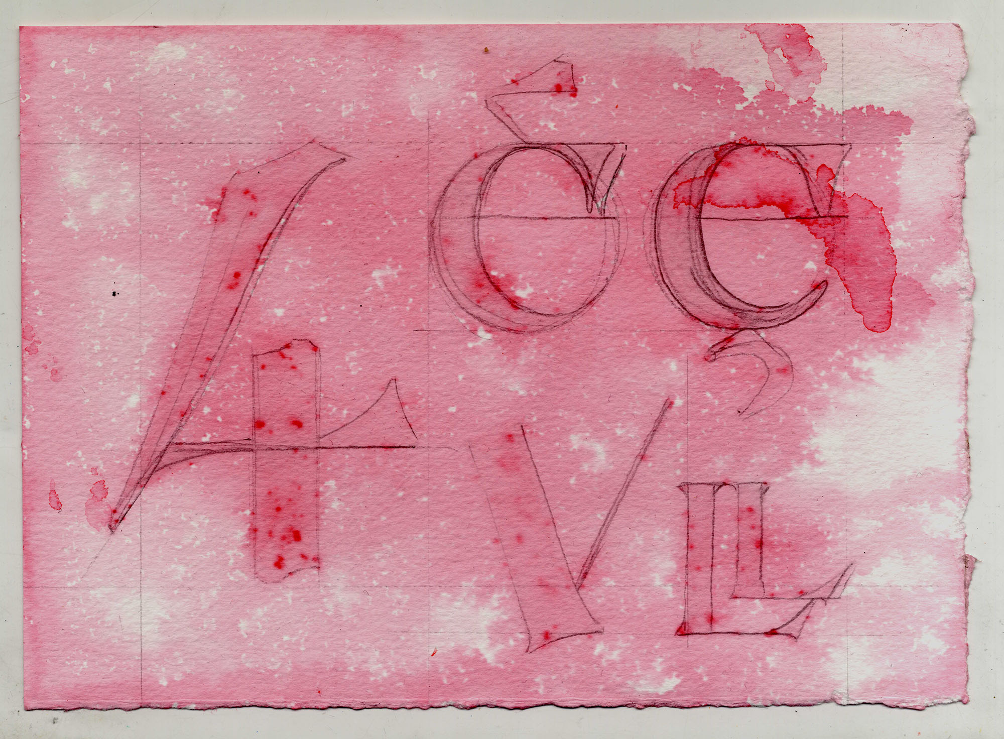
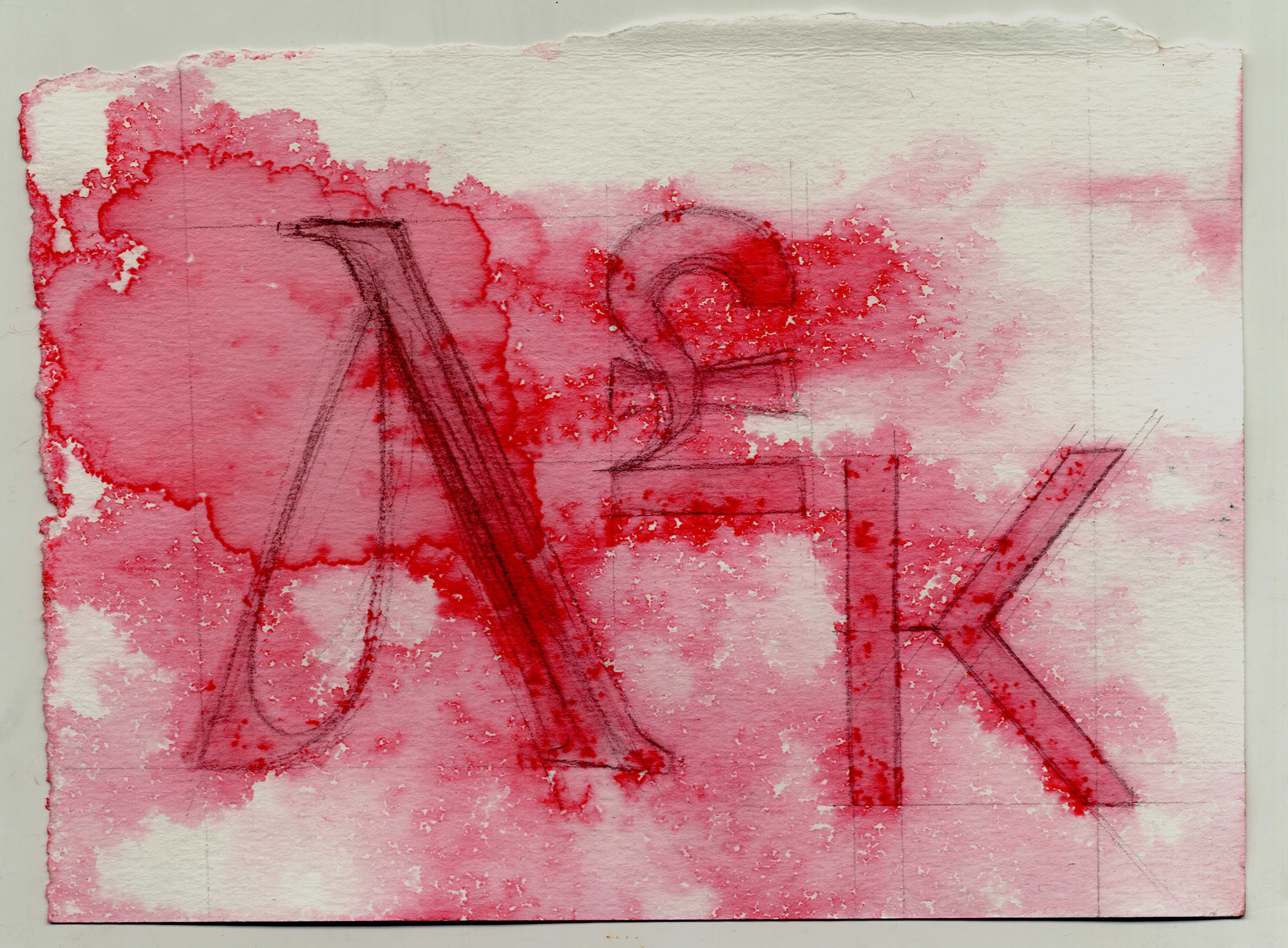
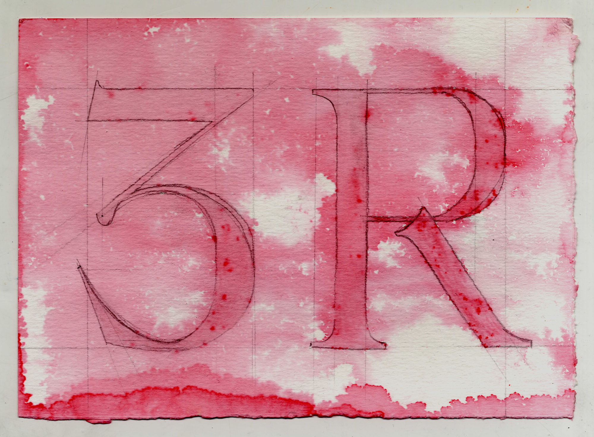
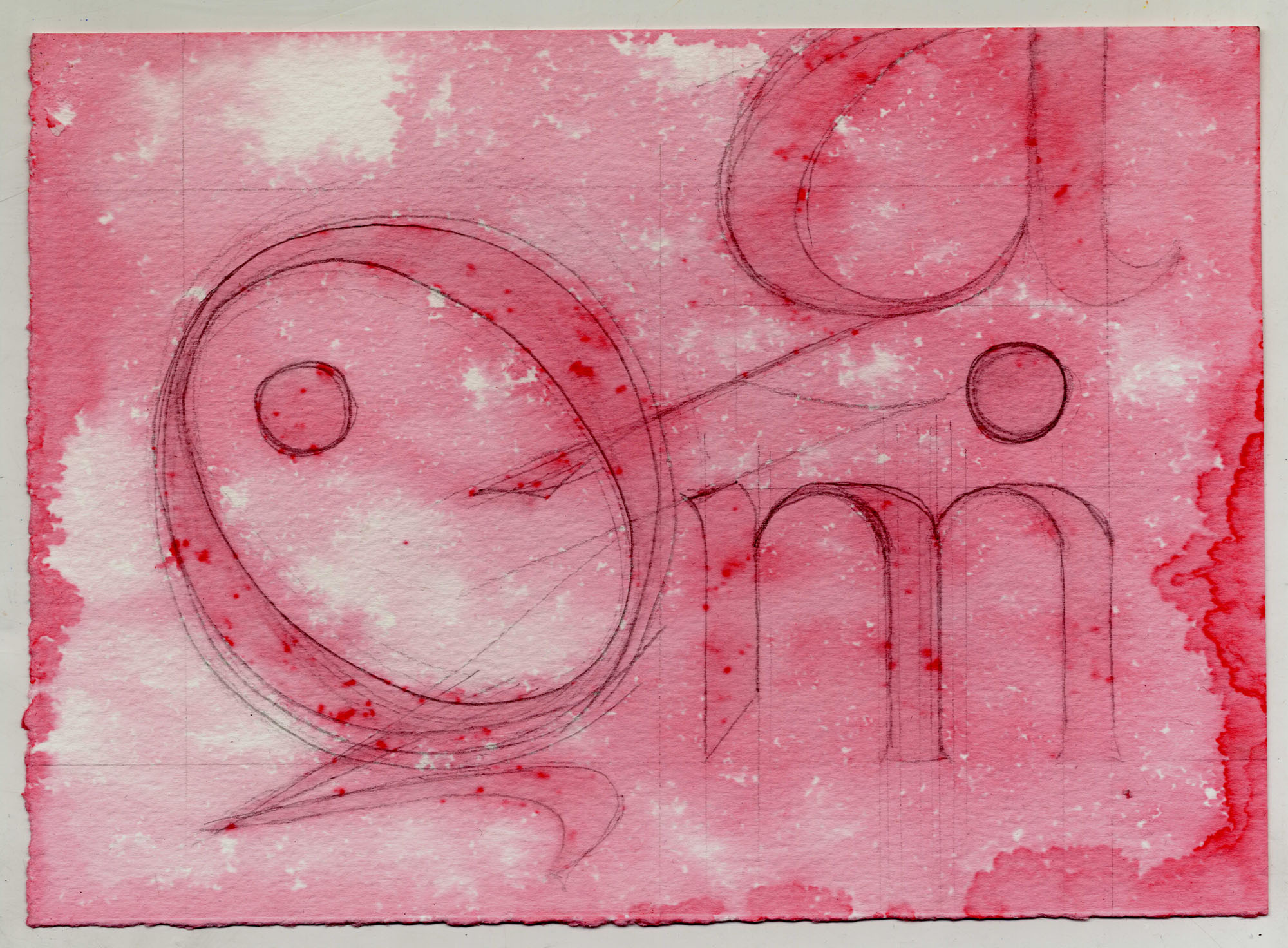
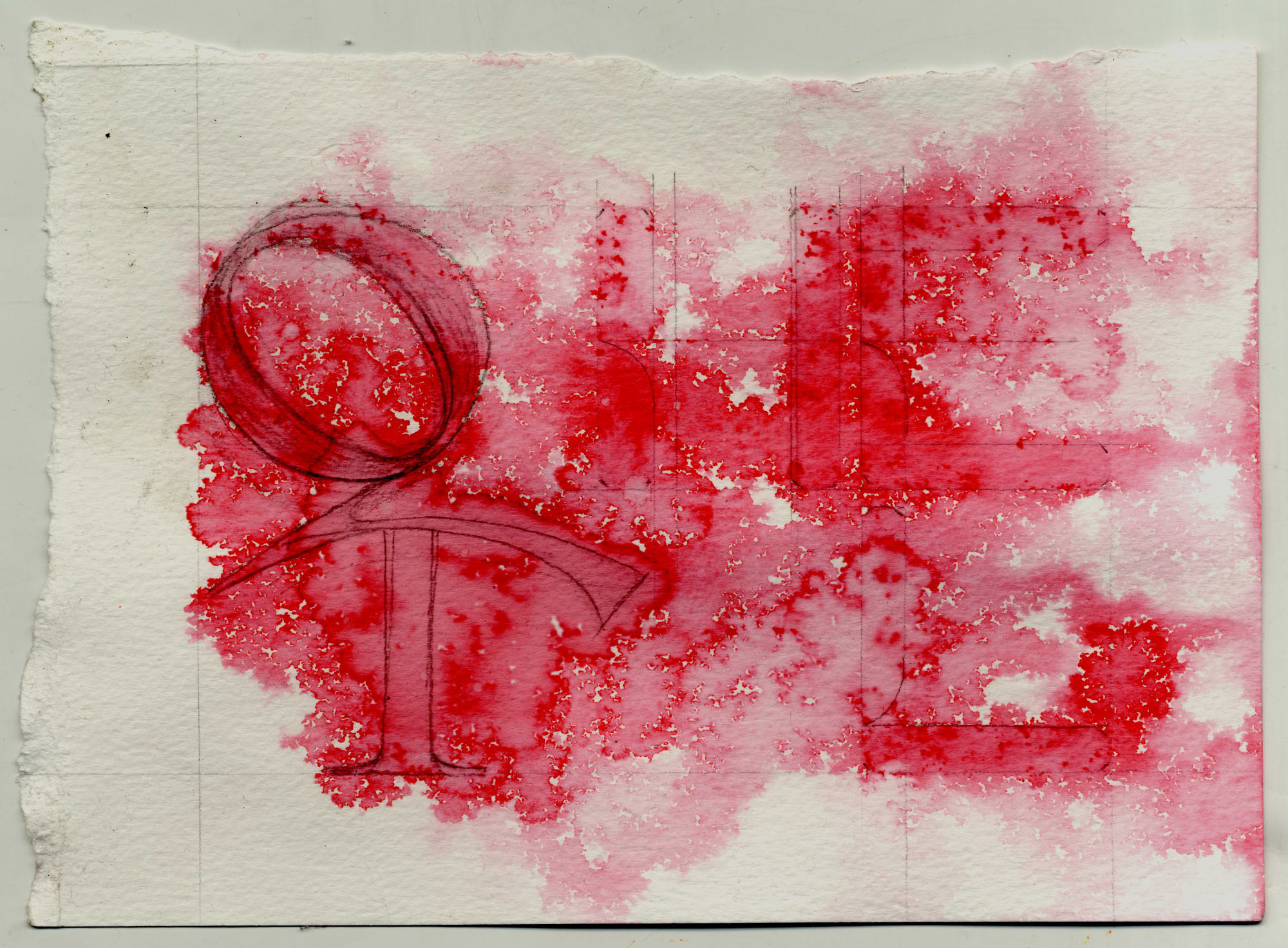
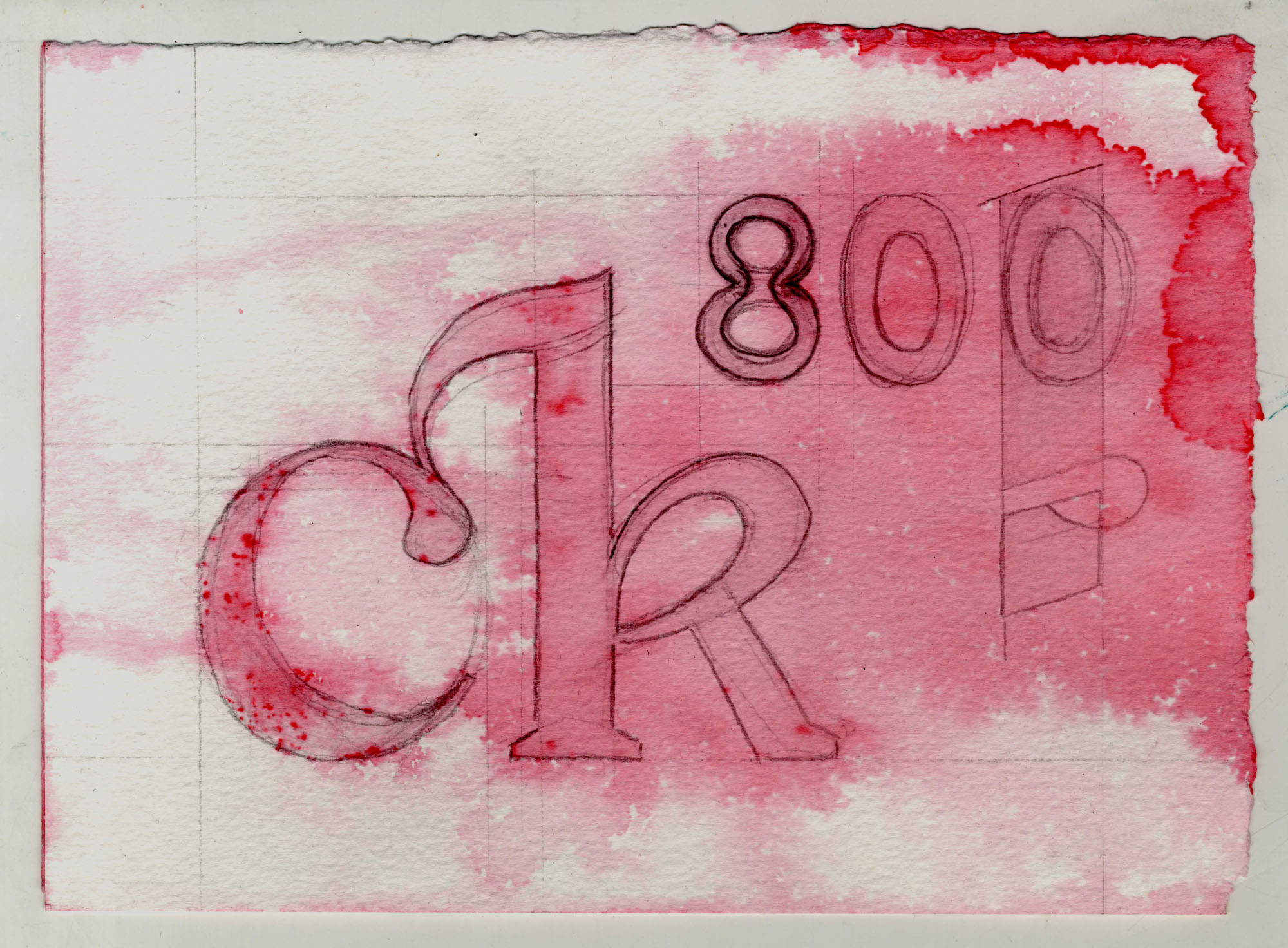
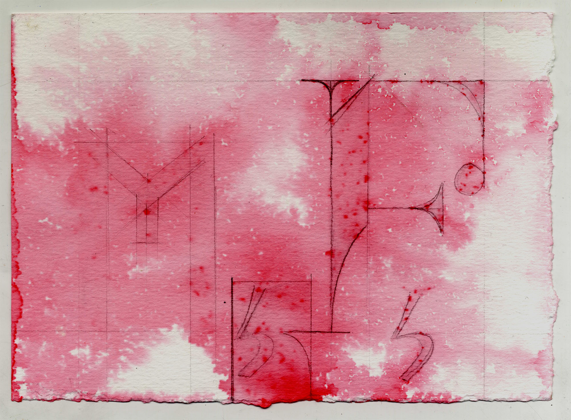
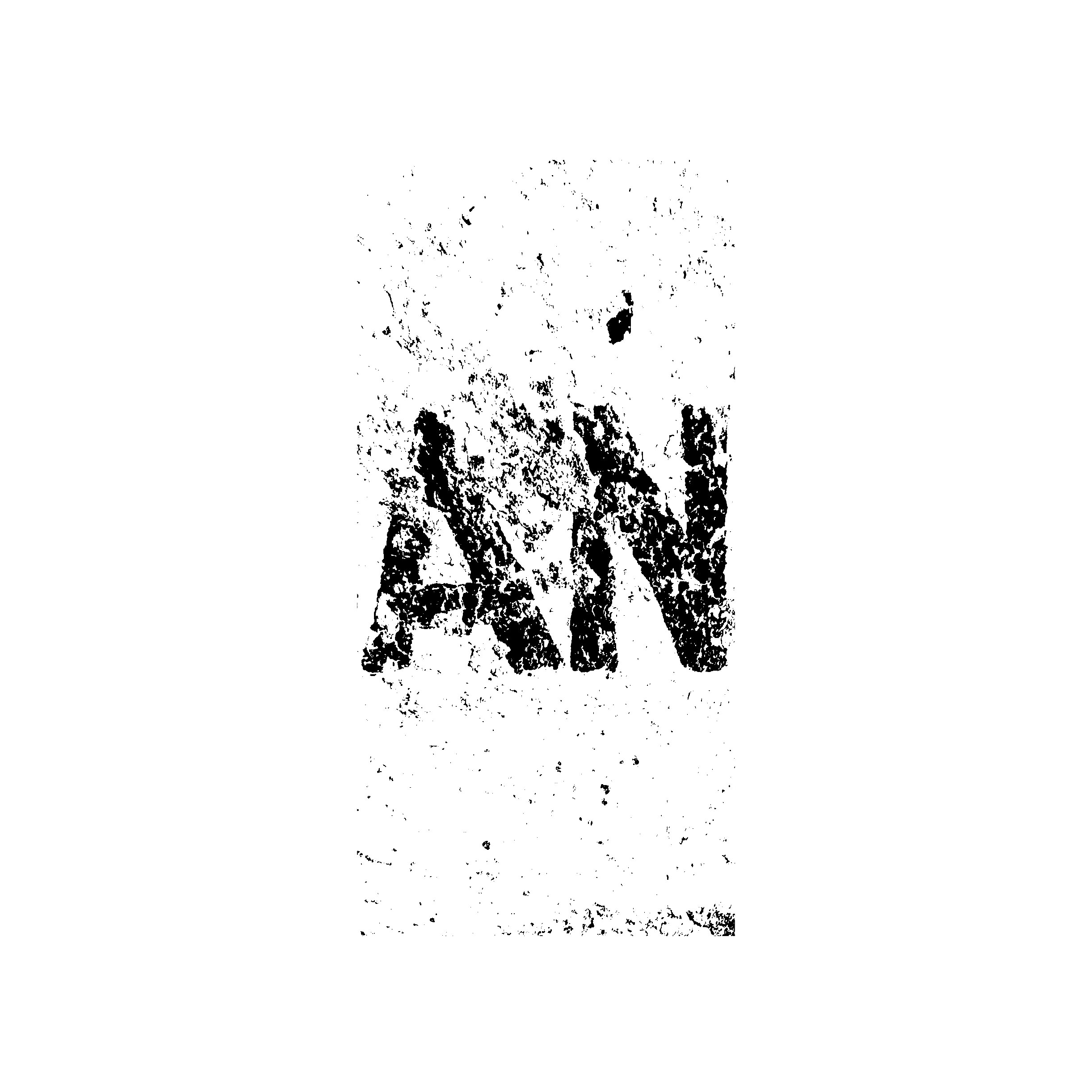
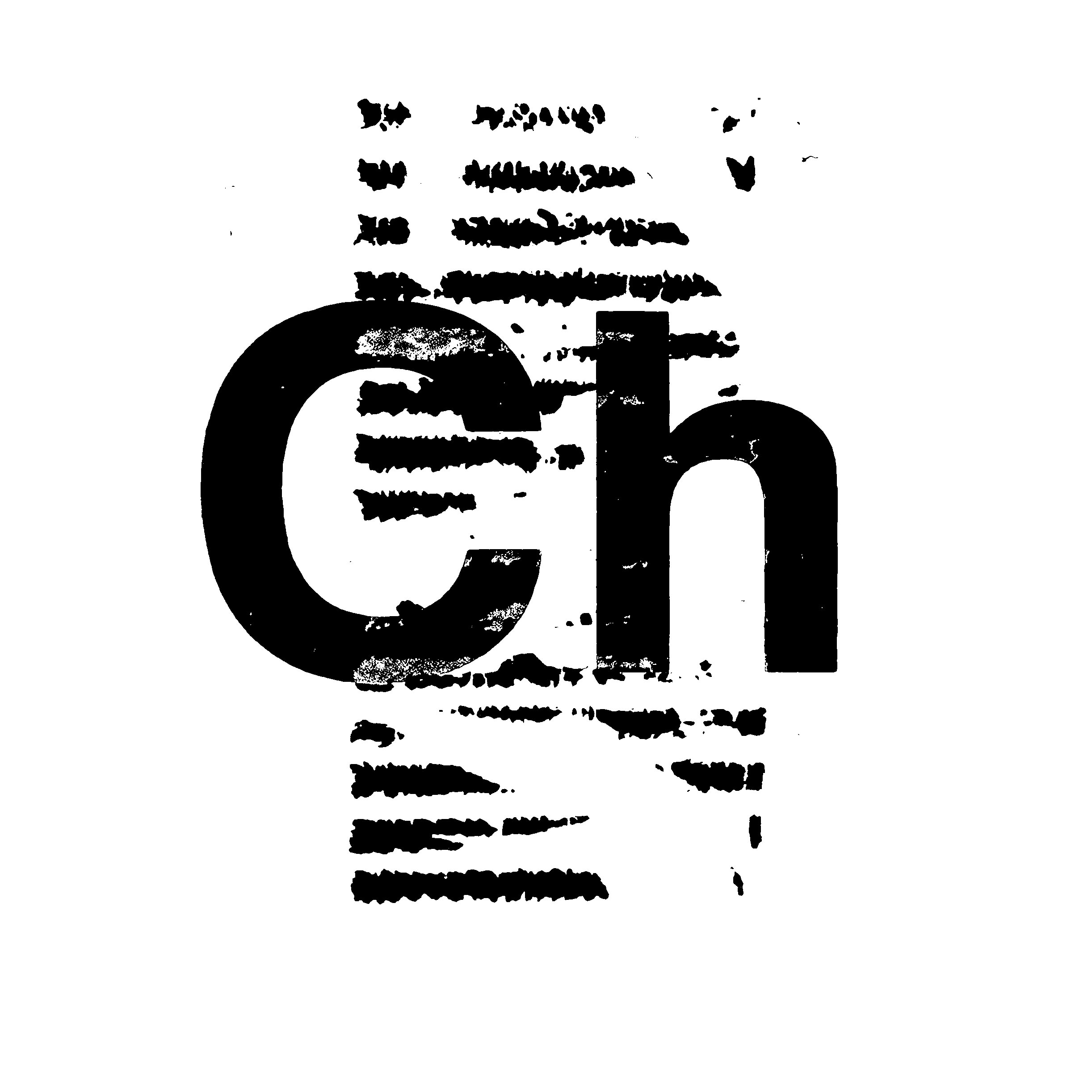
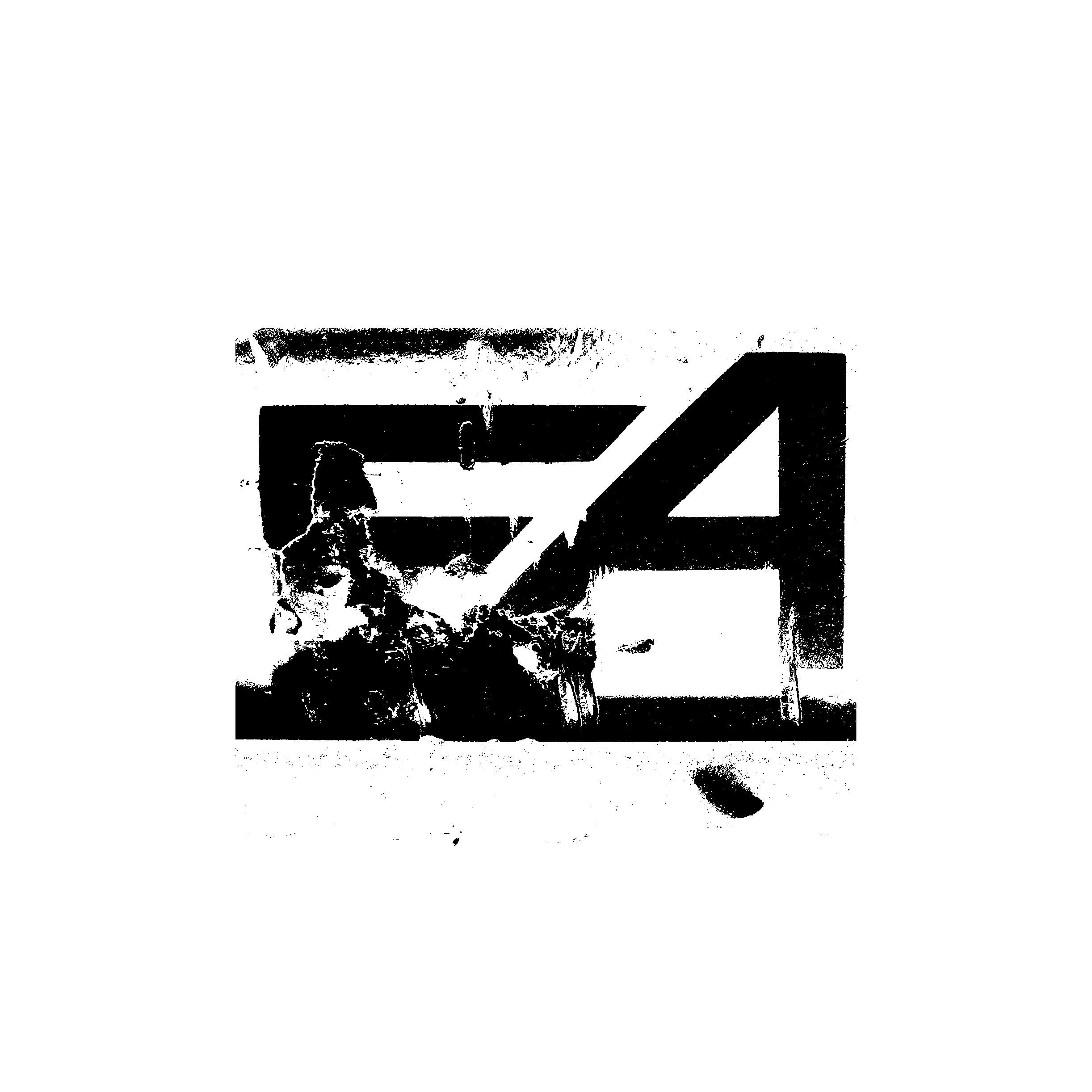
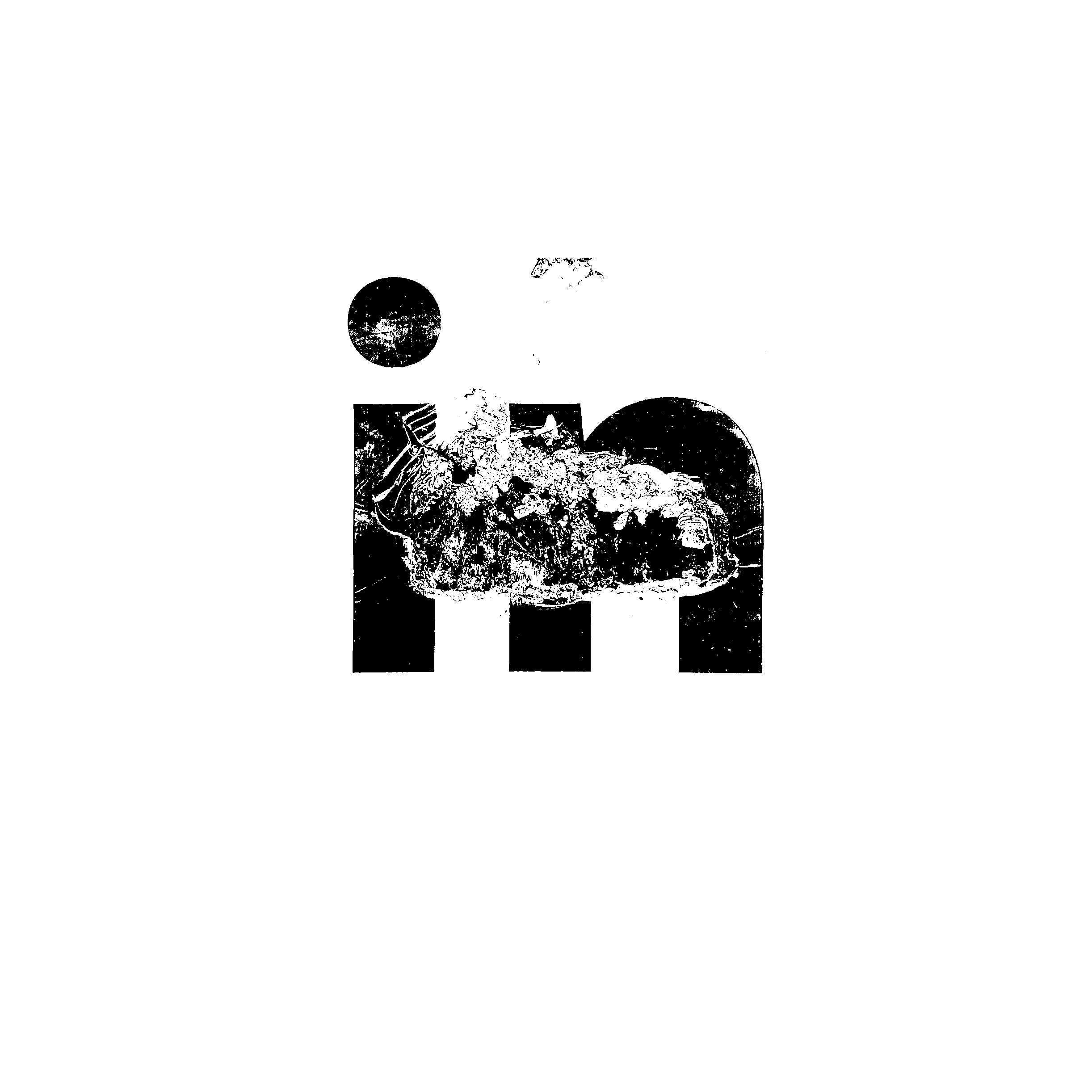
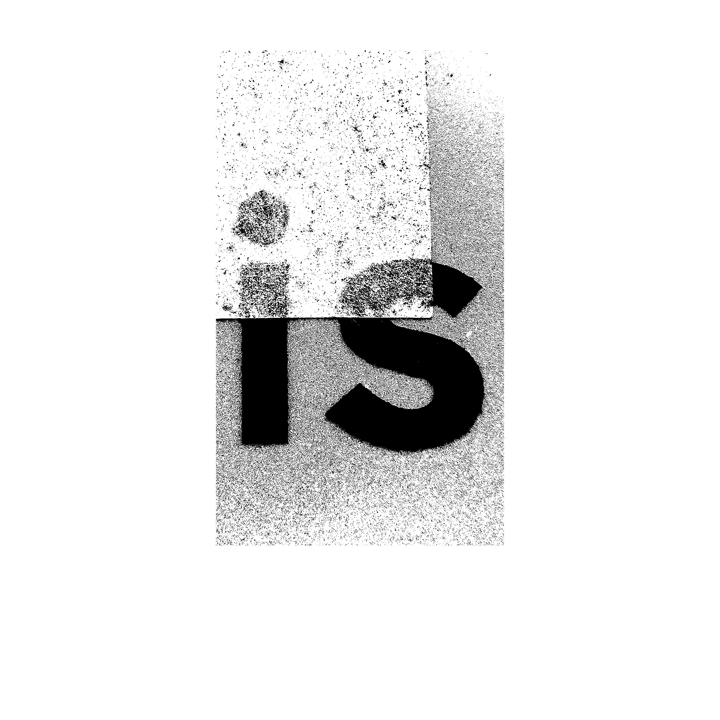
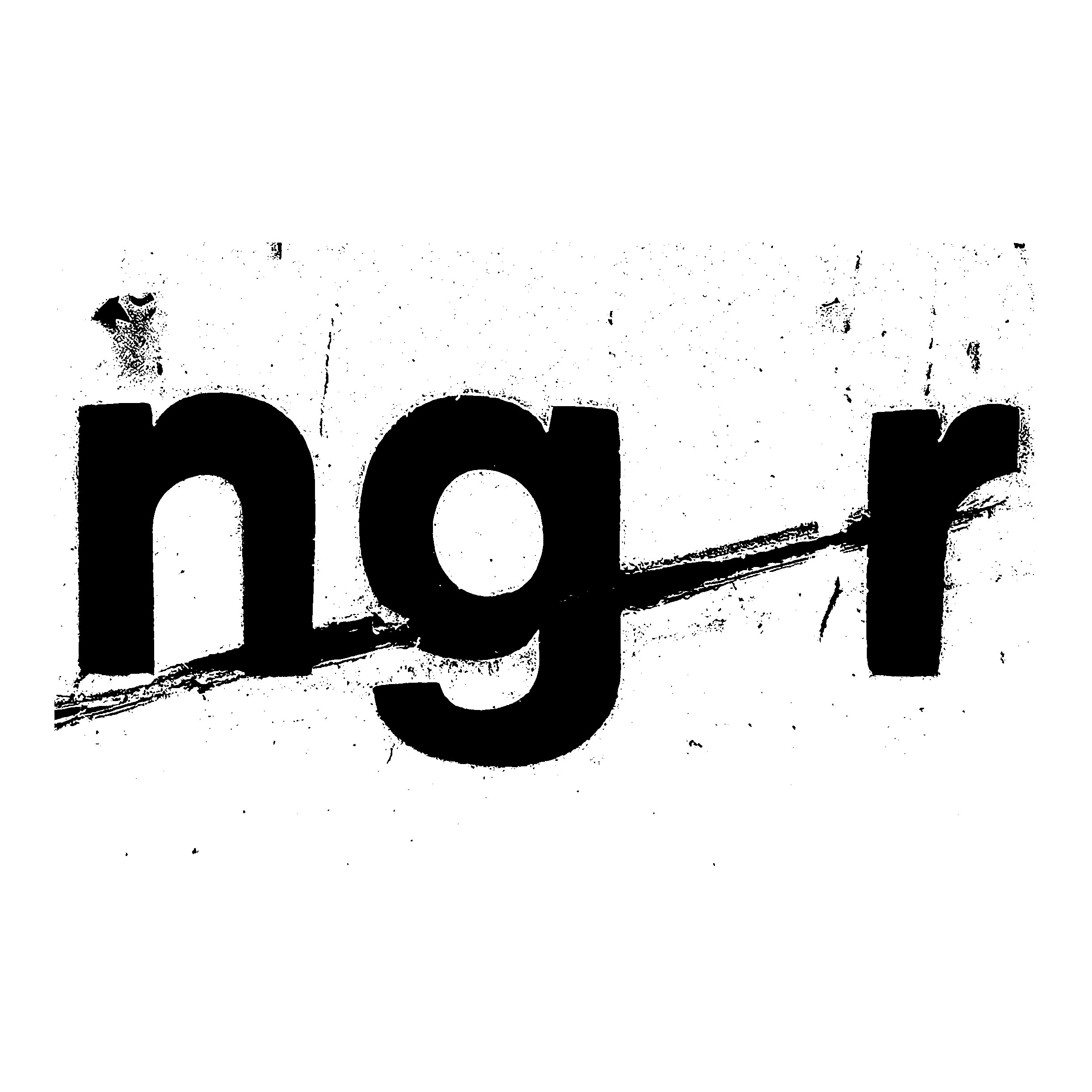
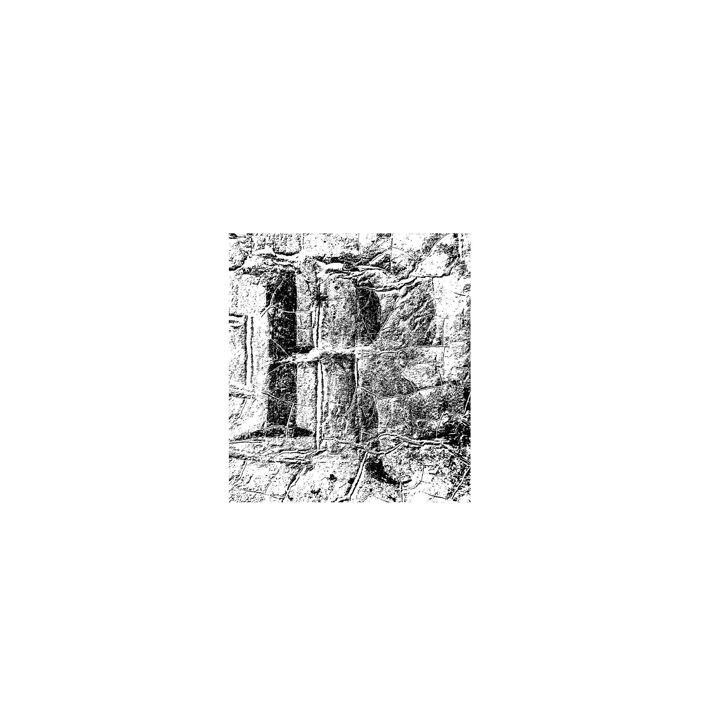
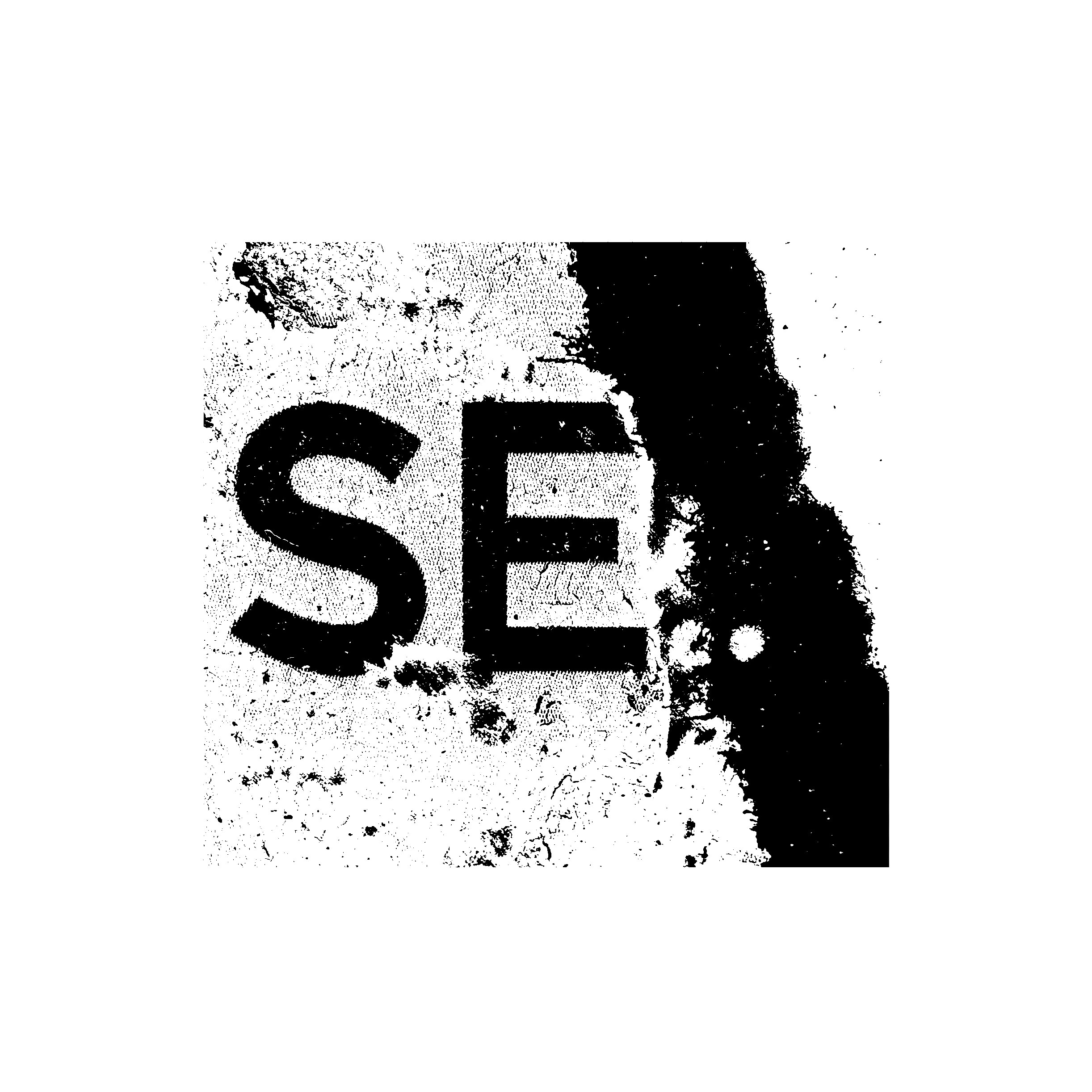
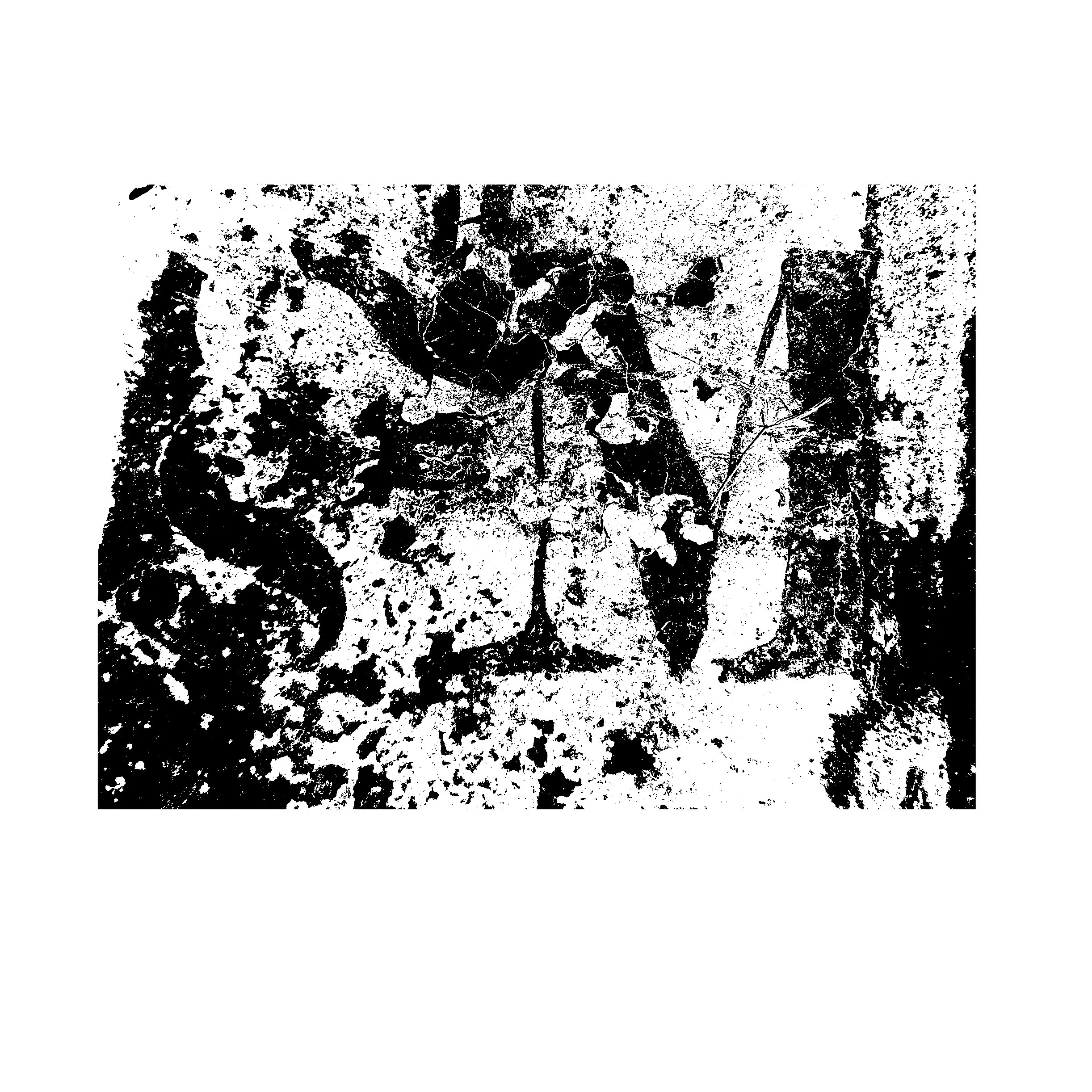
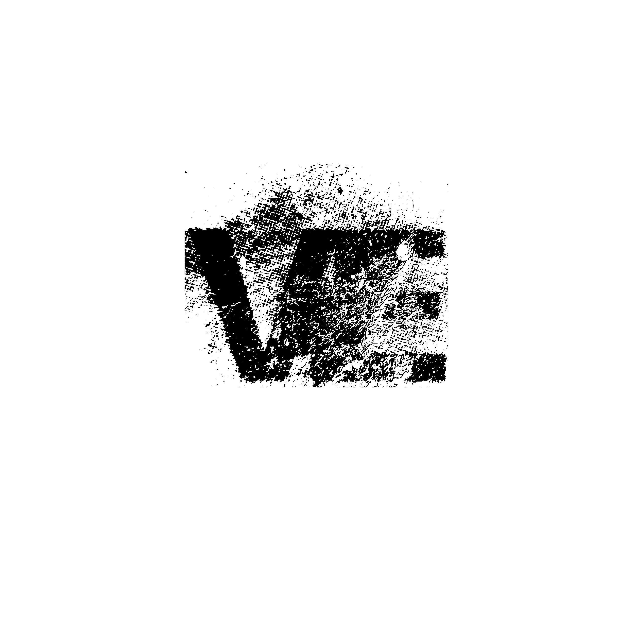
Making stencils and putting the results in dynamic spaces to undergo transformation for my missing ligatures.
Poster research
I like the green on this poster. The single colour composition doesn’t reveal much when I saturate/blur it. I think the difference between type as shape vs. type as information is interesting – the Green type is engaging whether it can be legible or not, whereas the black type is very functional. I like the idea of having a set of information that borders the posters in a very functional way like this, and can be applied to the poster series.
Marcus Wachter, Miriam Humm: TÄGLICH GEÖFFNET, 2019
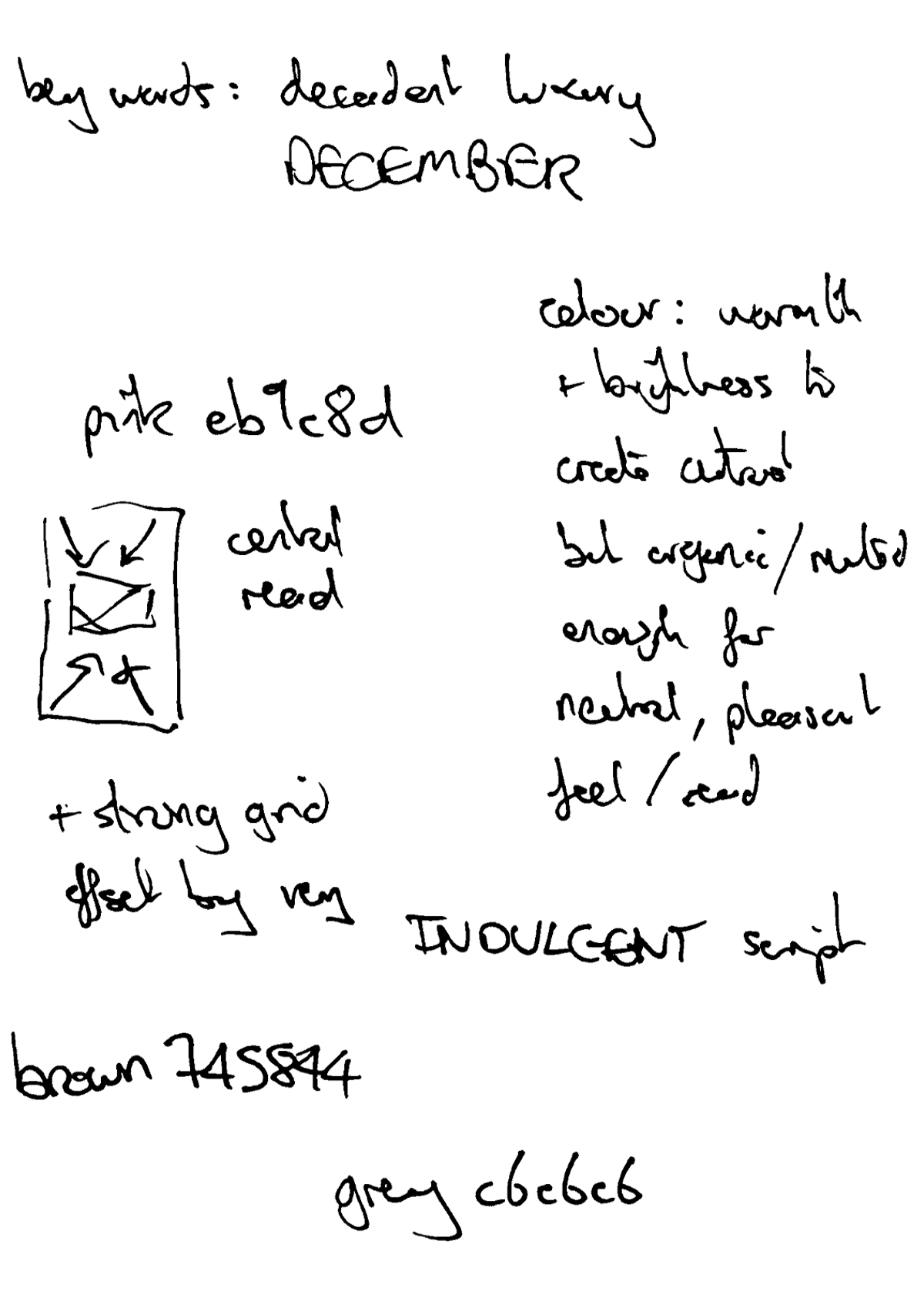
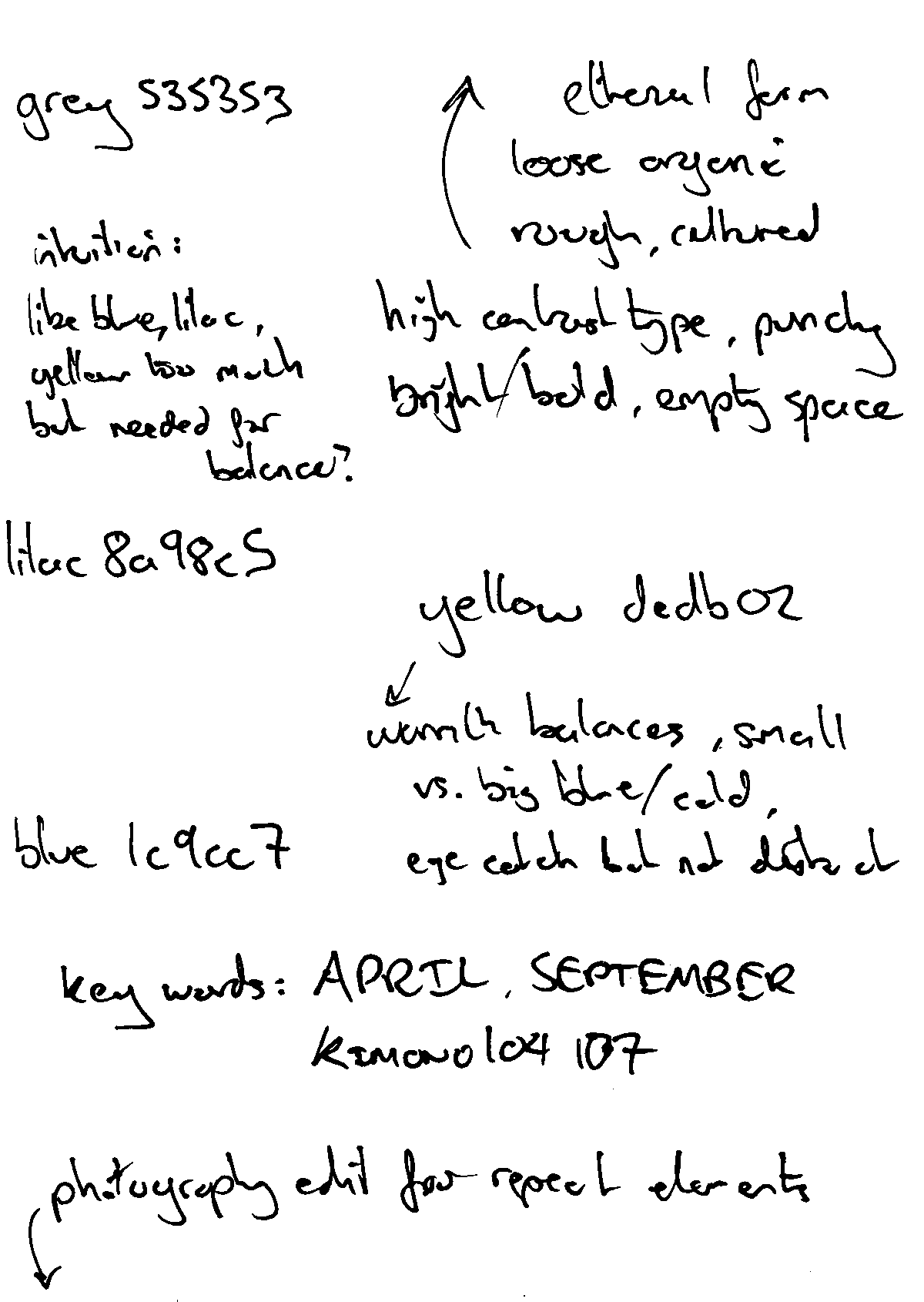
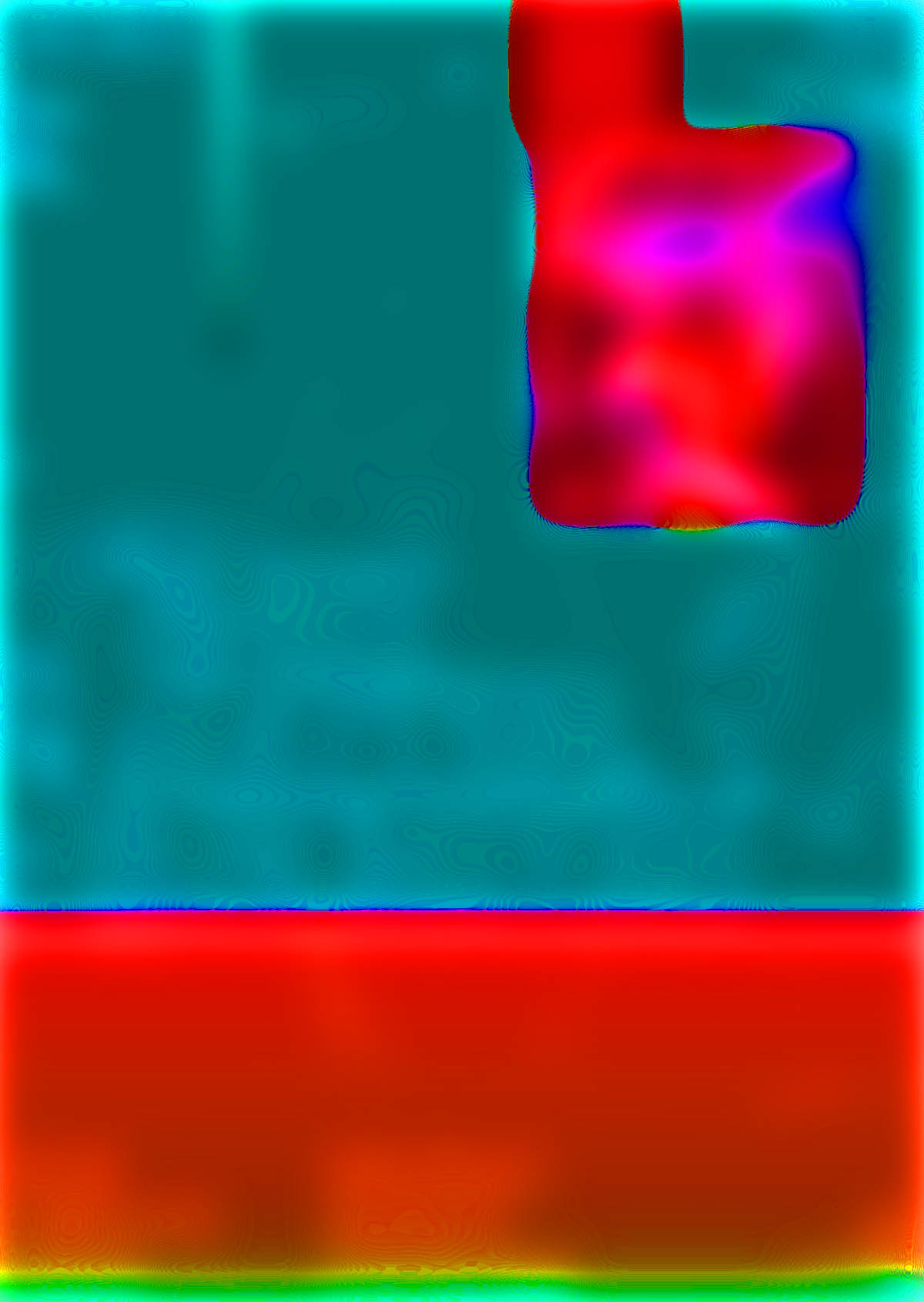
The grey brown pink is very decadent and indulgent. If i blue and saturate the poster I can see the focal point is very central but not much else. I like the use of grey as an offset to the brighter, warmer pink. I want to replicate this type of balance in at least one of my posters, though unlikely it will be with the pink and brown. I would like to use brighter colours.
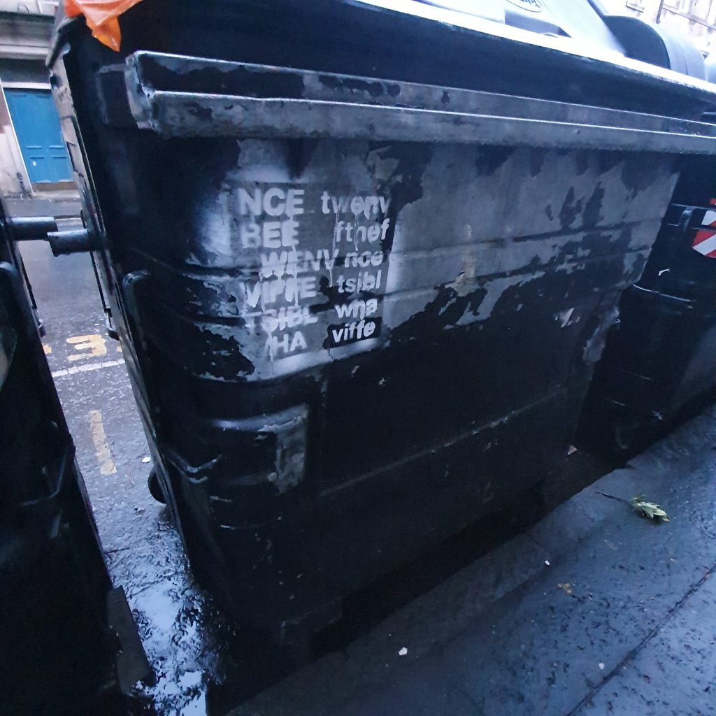
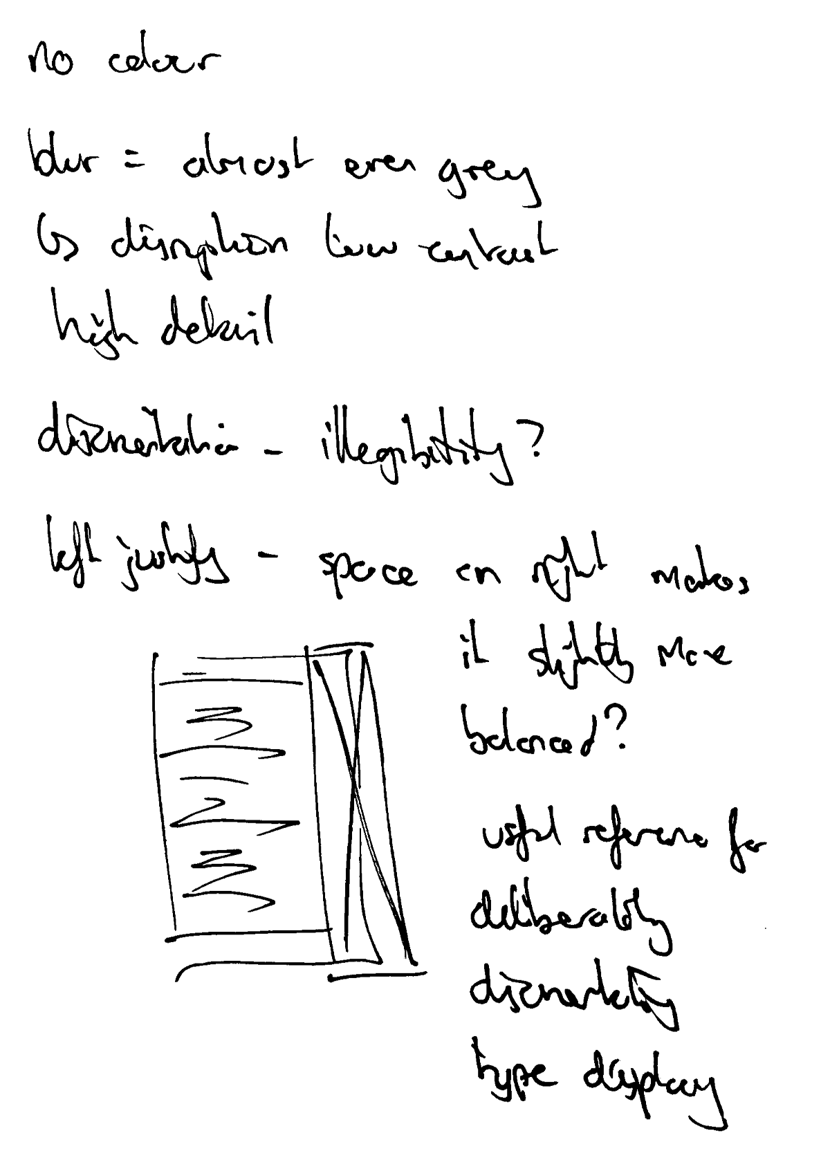
This is an interesting study in the limits of legibility and the way type is either shape or information depending on the scale at which its seen, or the distance from which its seen. I think its important that the type is left justified so as to create enough negative space to balance the effect of the distortion. A full block of text with this treatment would be very disorientating.
Lorraine Li: I hope, 2019
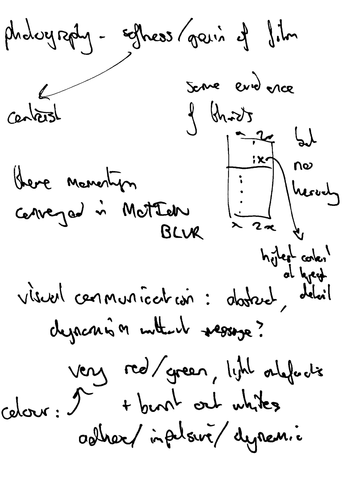
This is a useful photograph reference. The composition is interesting in terms of colour because it relies on strong contrast. For example, the lightness of the textbox works against the darkest portion of the composition. I like the film grain texture, though I don’t think I will be able to replicate this in my own posters.
Jonas Meier: Dwarfs of east Agouza + Deafkids, 2018
Colours are mint. Again, love the way the grey is used to offset the brightness of the pink and the darkness of the green. Grey as balance/mediation.
Vrints-Kolsteren: Antwerp Art Weekend, 2019
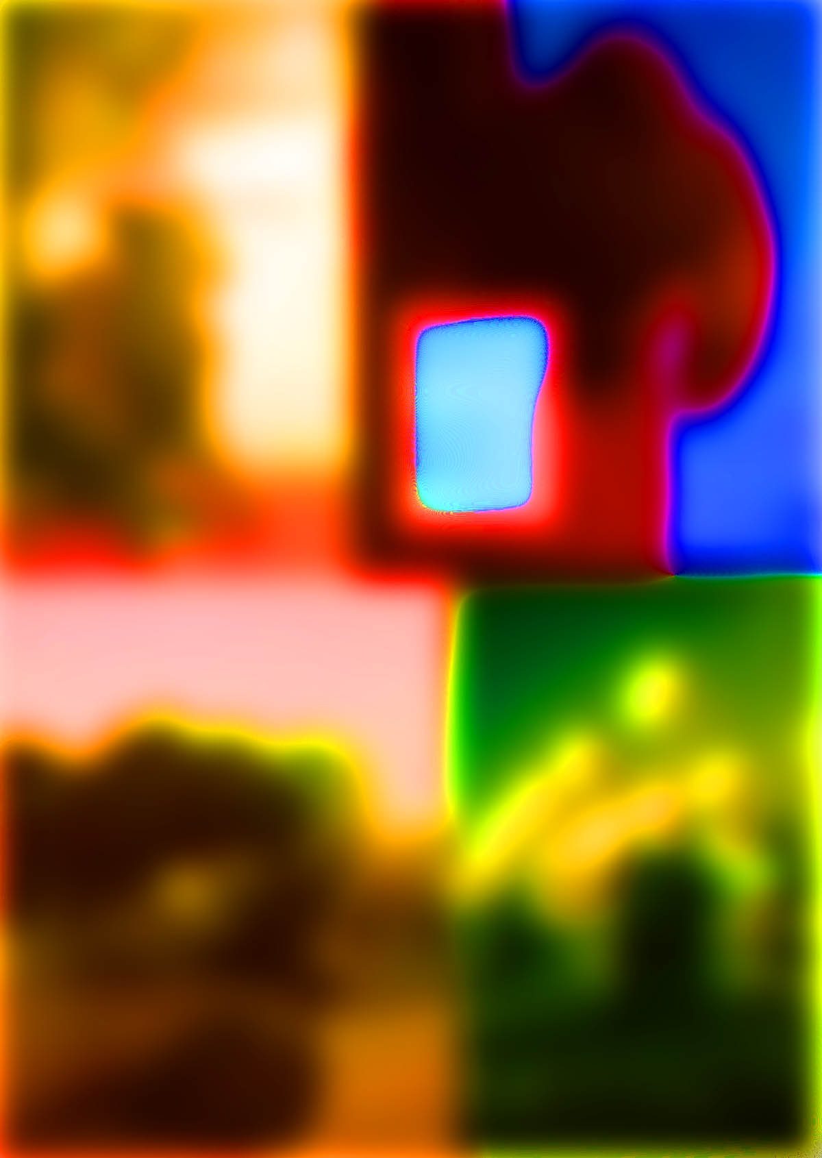
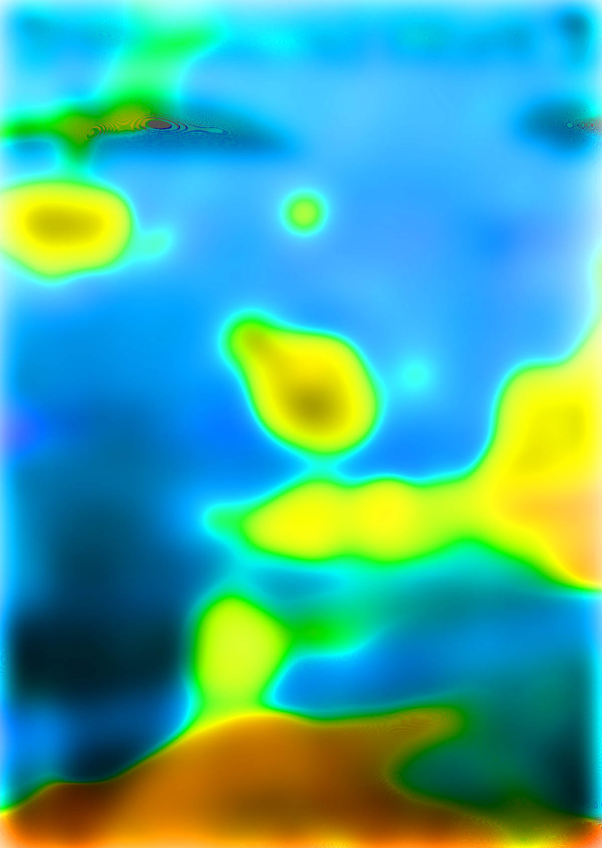
Blurring and saturating the poster shows little structure but the balance between the cold blue and warm yellow is retained – the ratio is good, there is harmony. It is interesting as a photograph study because it is relevant to the type of work I am undertaking – disrupted textures on walls/urban contexts.
Virgil Flores: Weekend Work, 2019
Again, the grey balances the blue/pink/green in a way that I want to emulate. I’m not so keen on the pink but I love the blue and the green.
Pierre Vanni, ThéâtredelaCité saison 18-19, 2018
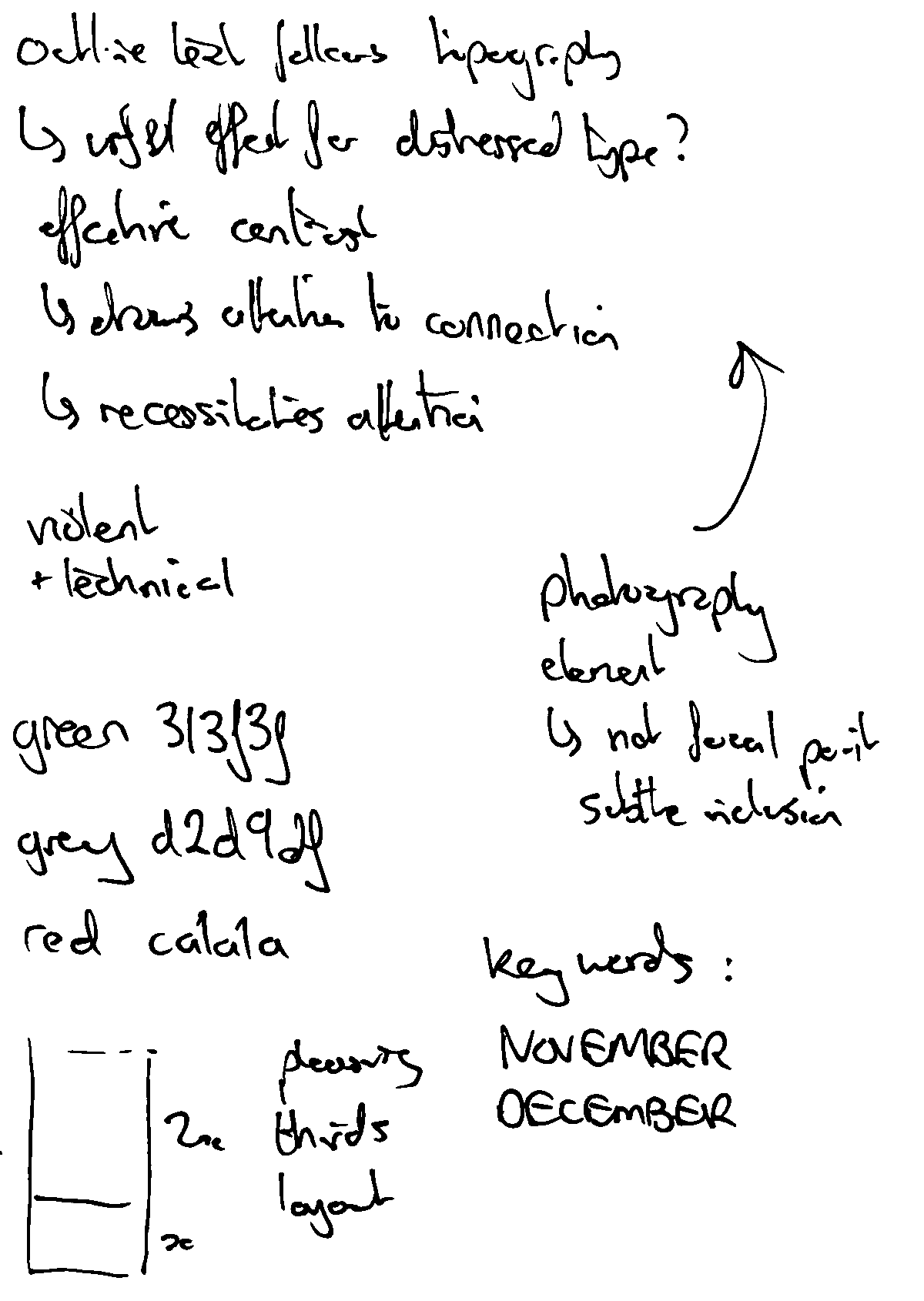
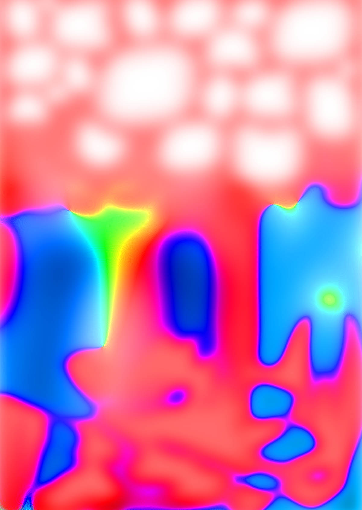
Blurring and saturating the poster shows there to be strong boundaries, a calculated mathematical approach to contrast, emphasising use of thirds. Ratio between bold and subtle colours creates balance, harmony – disruption comes in the technical lettering and detail that is lost when blurred/saturated.
Virgile Flores: Grey Matter Archives, 2019
Cool colours. The photography treatment is interesting – halftone or gradient map for photos softens the details and allows it to blend into the background. This is a useful technique for me because some of my type has very harsh crops due to the nature of the photography. Blending it like this might be nice.
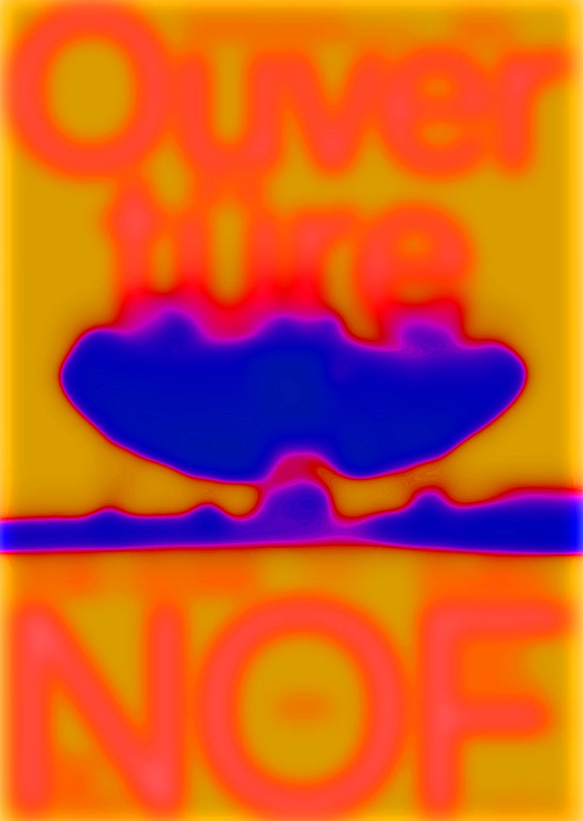
Neo Neo: NOF: New Opera Fribourg, 2018
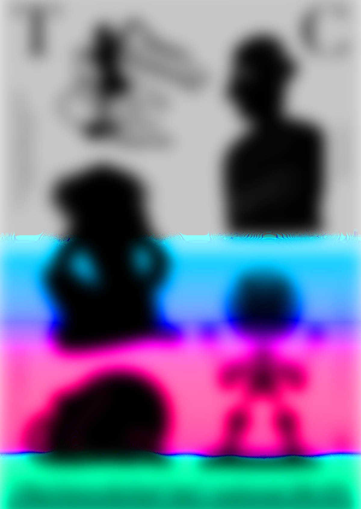
When I blur and saturate the poster I see no structured layout – it feels overwhelmingly pink/red and the blue is not enough to create balance or harmony. This works with the content of the poster. The sharpness of the shapes are softened by the colours – a saturation of soft pastel colours is needed for this to work, I guess. I like the softer, lighter blue on the right side with the pink of the blurred text above it.
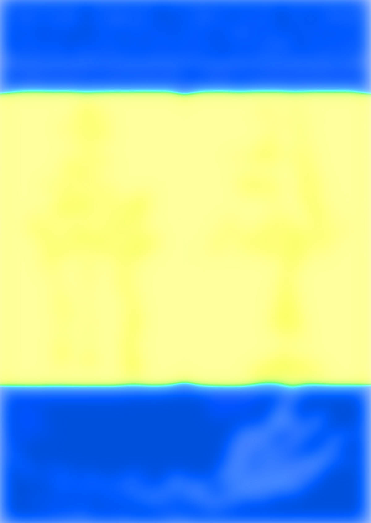
Sangah Shin: Mascot, 2019
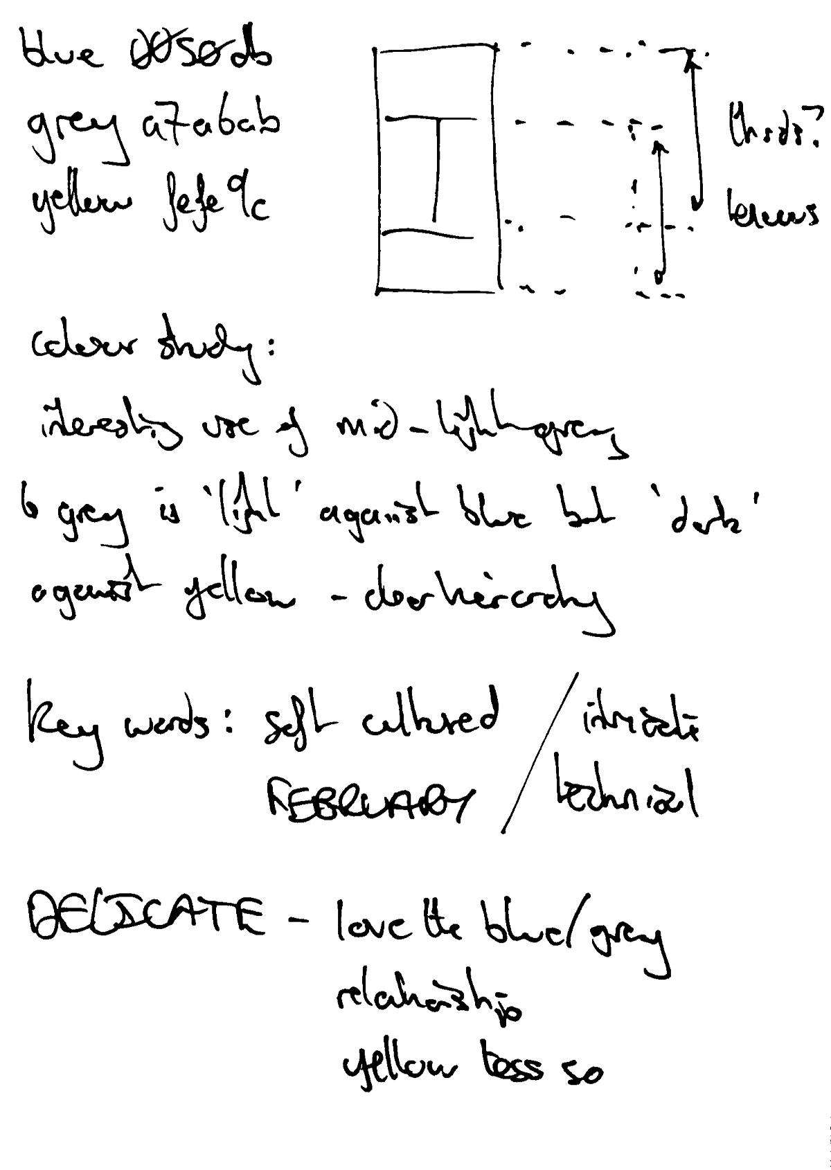
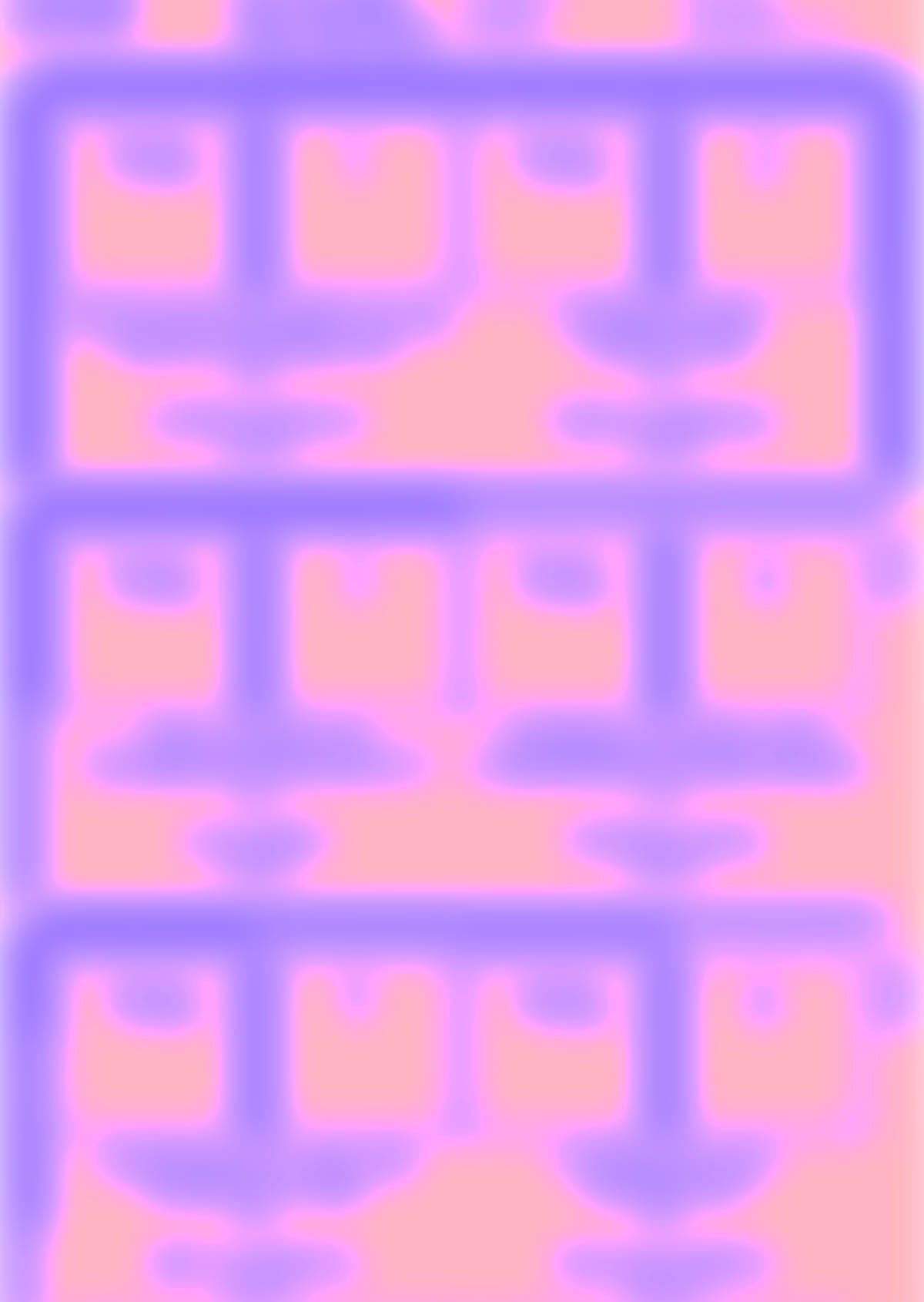
Interested in the use of grey, again, especially against the blue. Interesting that the neutral grey is the ‘dark’ colour against the yellow but the ‘light’ colour against the blue. Blurring removes the detail, reveals a structure that might indicate use of thirds. Not sure.
Min Jong Kim: Unique Form, Intan Kwak, 2019
This is interesting because it uses a very repetitive structure, which might be useful for me when repeating elements of found type on my posters.
Matt Asato-Adams: Near Future Fictions, 2018
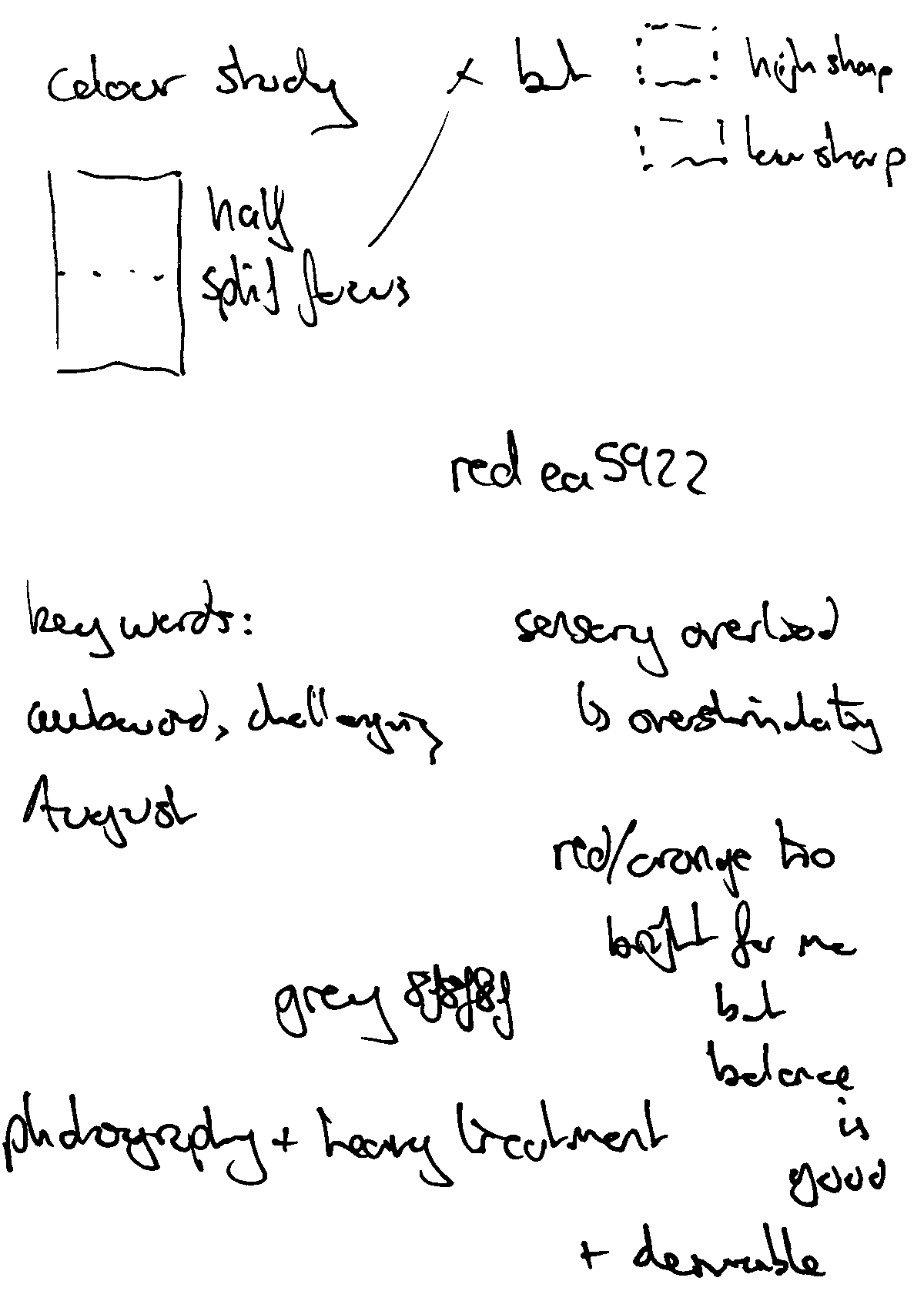
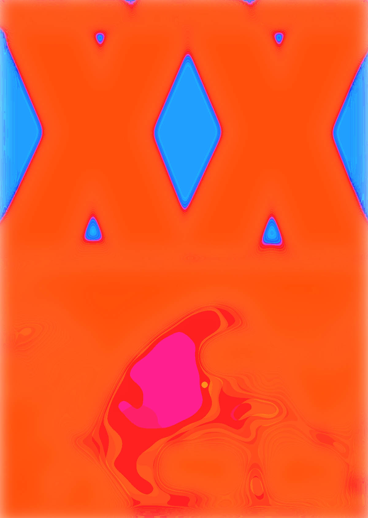
Blurring and saturating the poster doesn’t give a fair reflection of the balance of neutral/bright in the lower half, but does emphasise the difference in sharpness – despite the awkward colour pairing the contrast in sharpness between upper and lower halves retains a sense of order and structure. Reflects the nature of the content well – the boldness of the XX vs the confusion/subtlety of what it signifies. I find the red too bright, the overall effect too stimulating but I am drawn to the balance of the colours and the depth of the neutral grey.
Neo Neo: Black Movie, 2018
Book Research
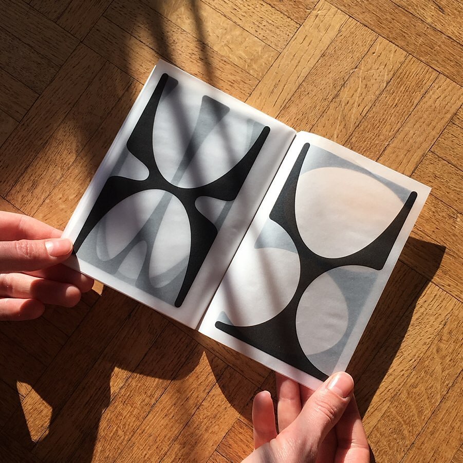
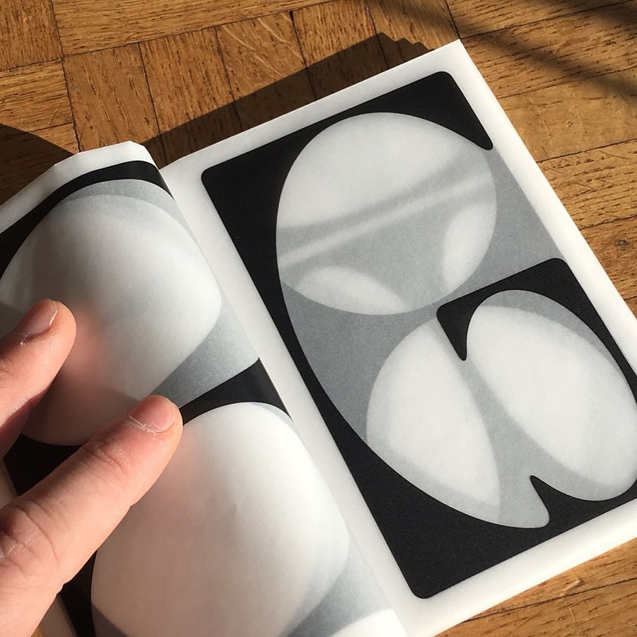
Test specimen by visual communicator Finn Reduhn. Using trace/translucent paper allows for layered interactions between pages – adds another read direction to conventional page turn. In this case, connections can be made between glyphs and relationships between their forms understood better.


![20201108_140634[1]](https://c9128483.myzen.co.uk/wp-content/uploads/2020/12/20201108_1406341.jpg)